Blackrope
Four identity directions for a members-only luxury access platform. Hidden villas, private yachts and invitation-only nights, every booking verified on-chain.
Four directions, each a different answer to one question: what does a door with no public listing look like?
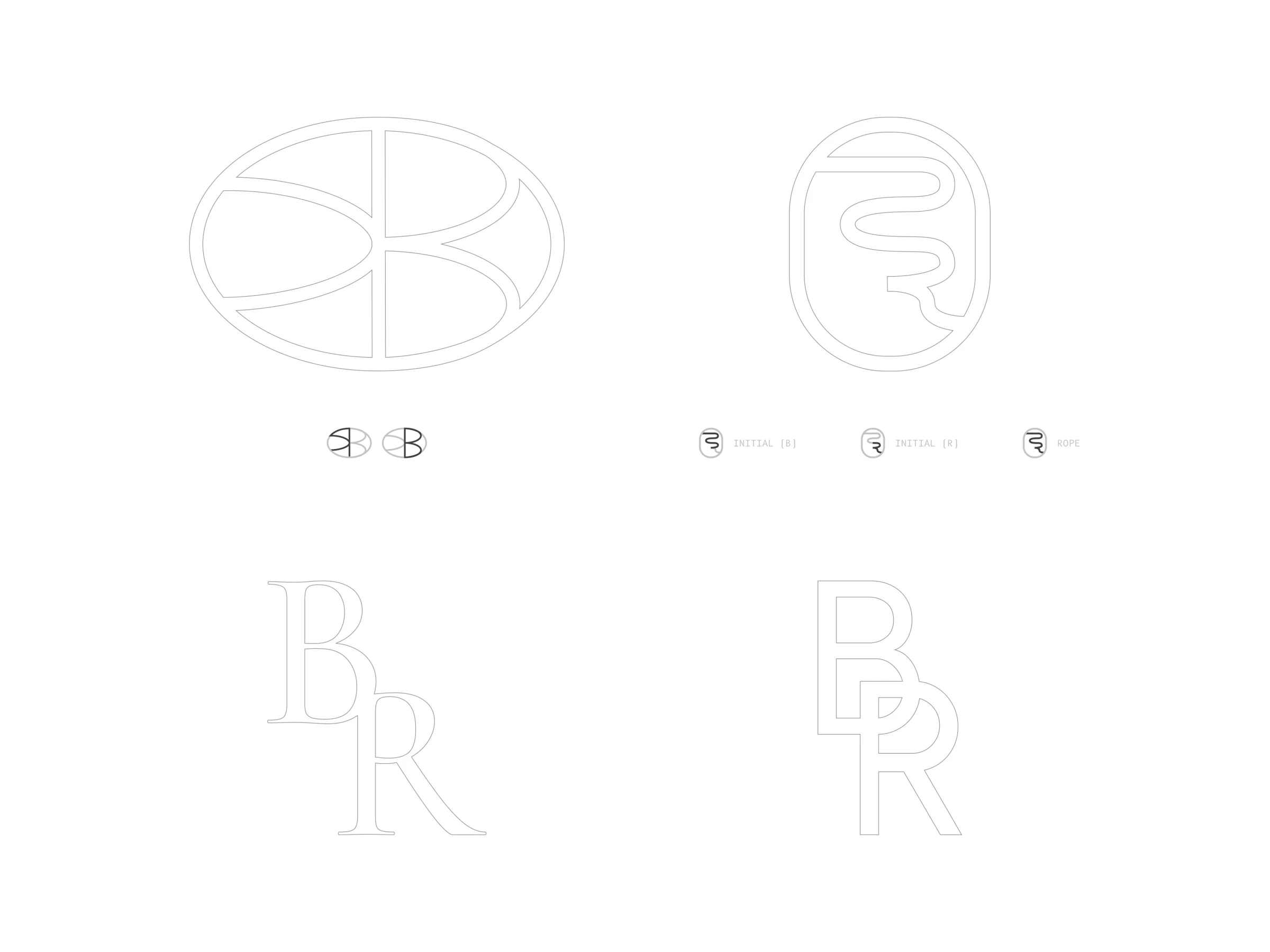
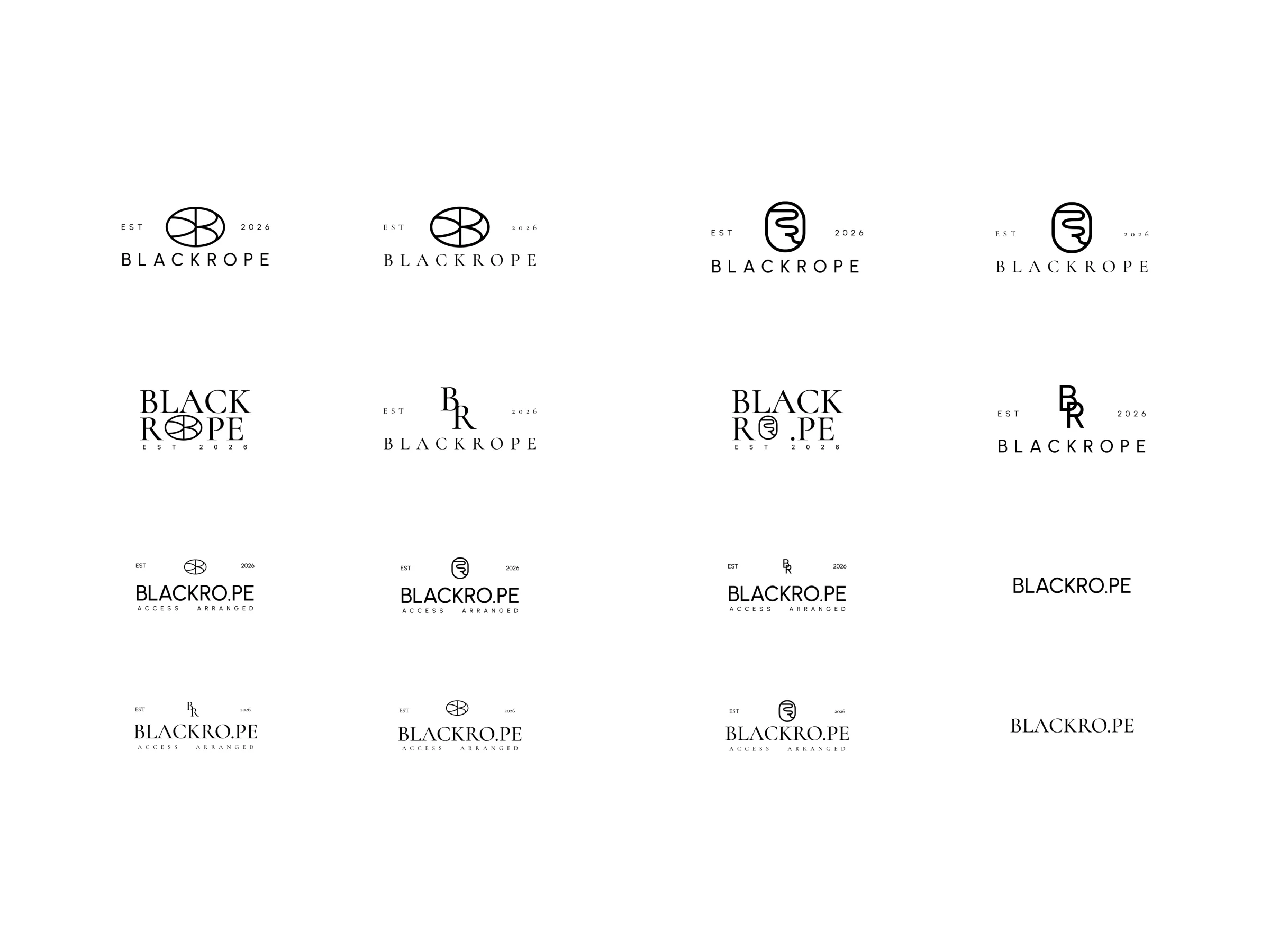
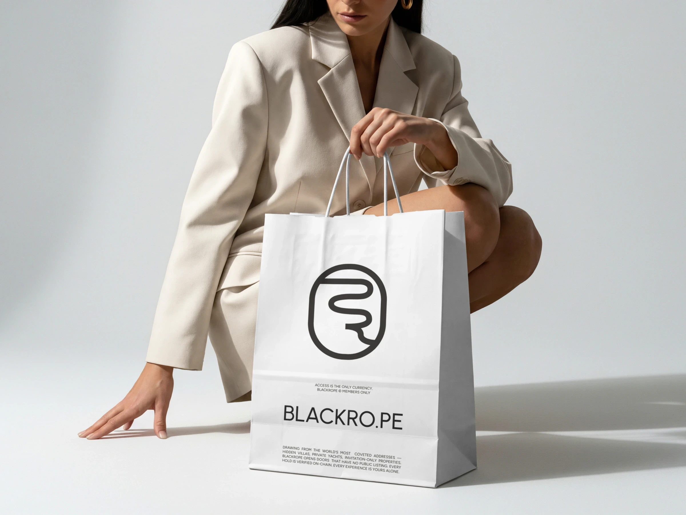
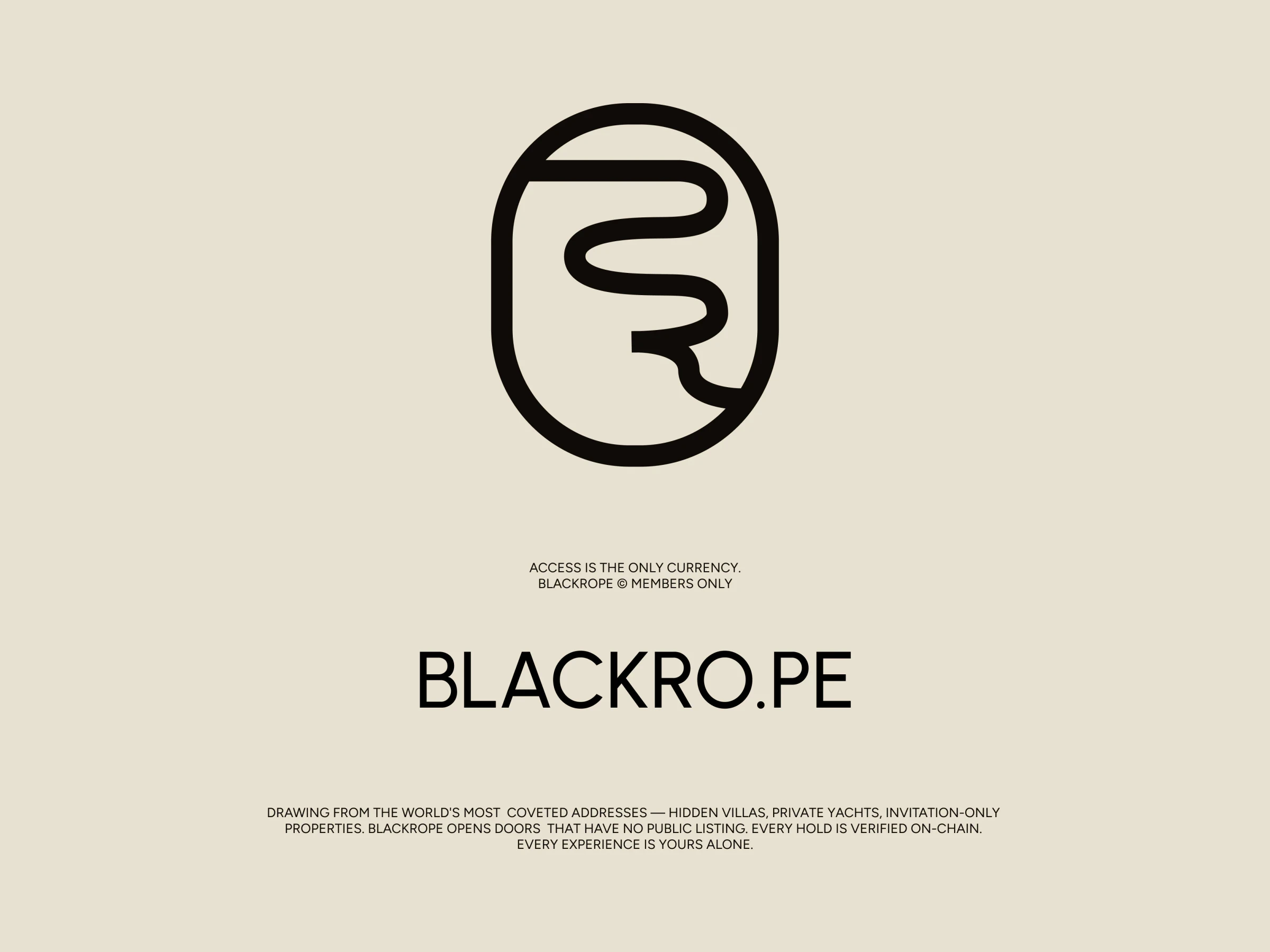
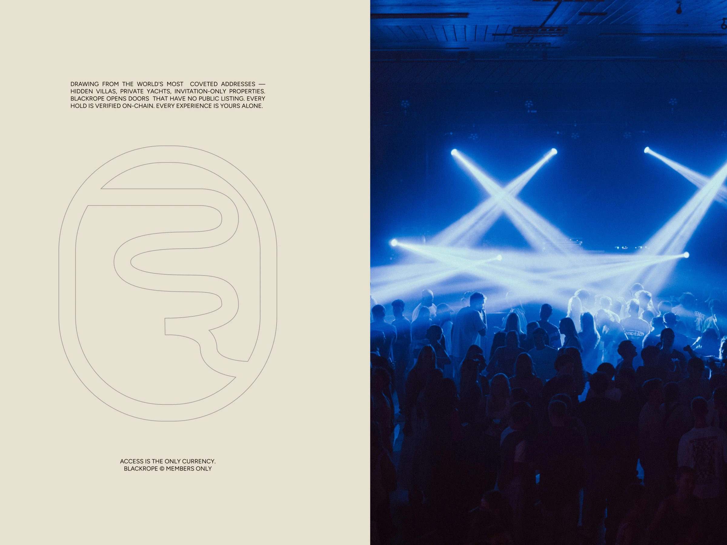
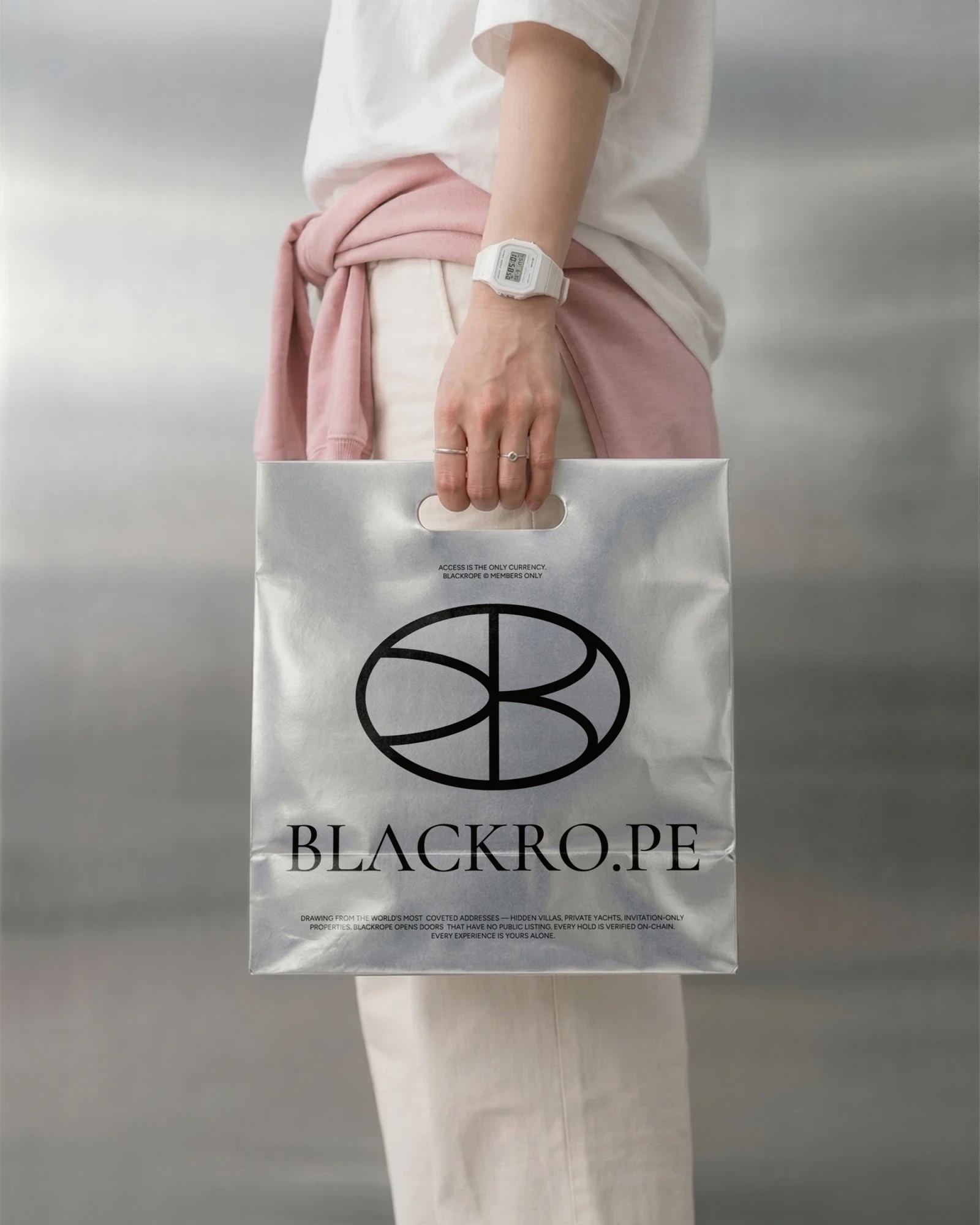
Concept one, the rope: a single line pulled into the B and the R, closed inside the shape of a door.
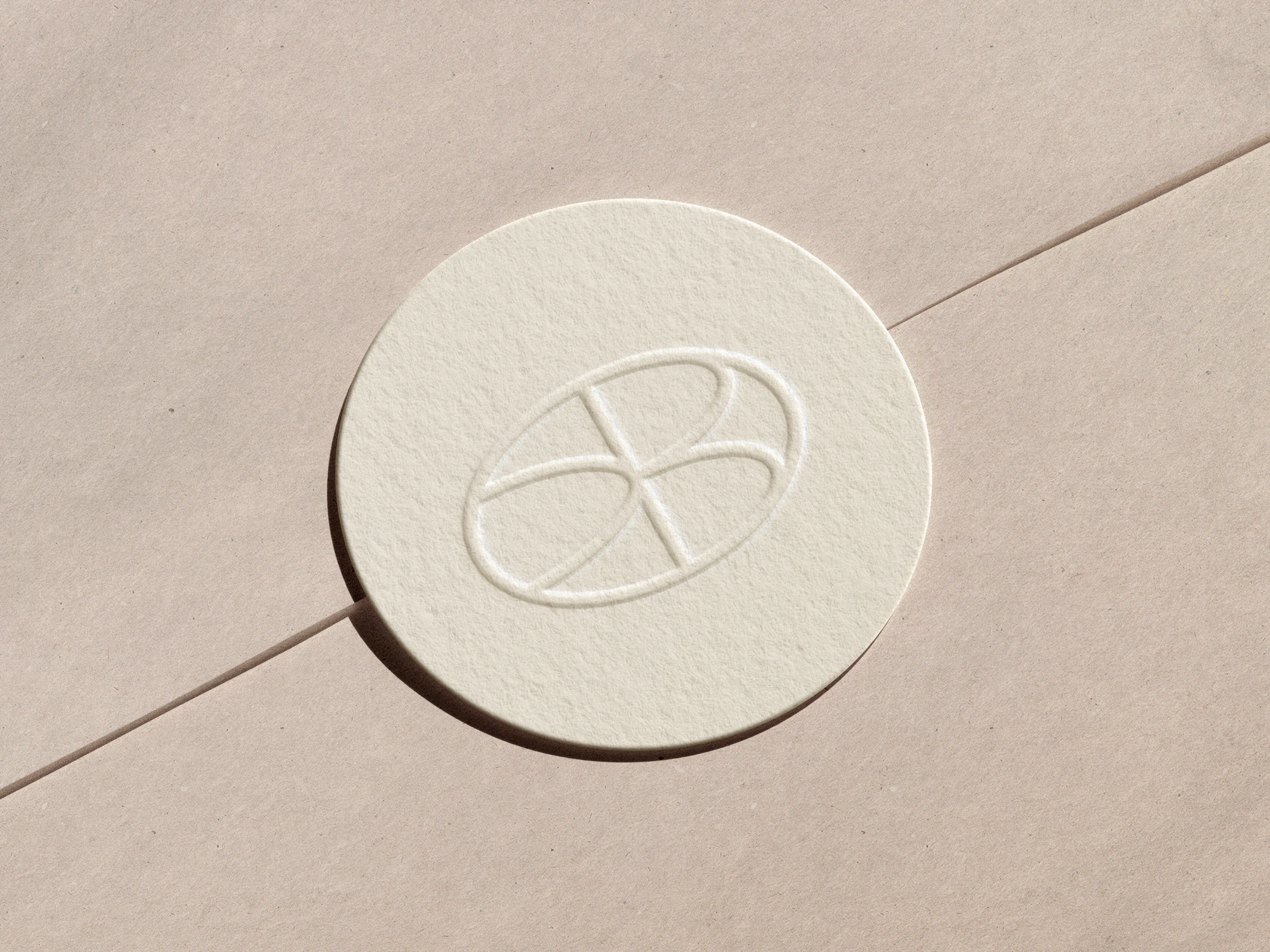
Concept two, the seal: a B and its reflection, closed into an oval that can be pressed into wax or paper.
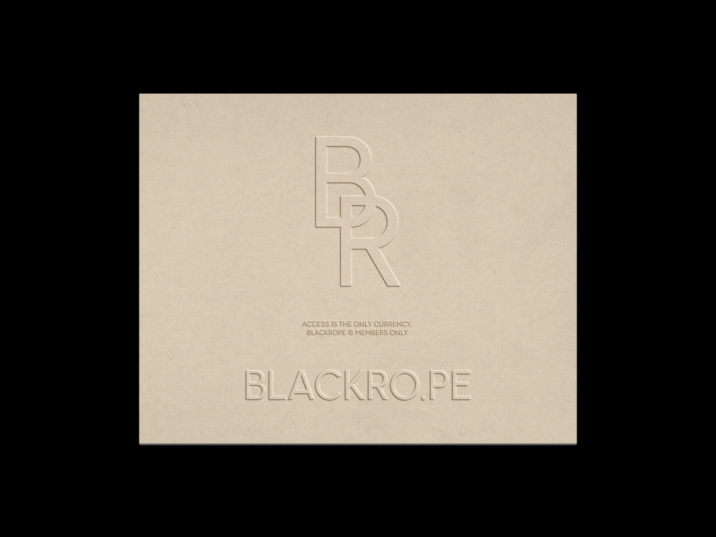
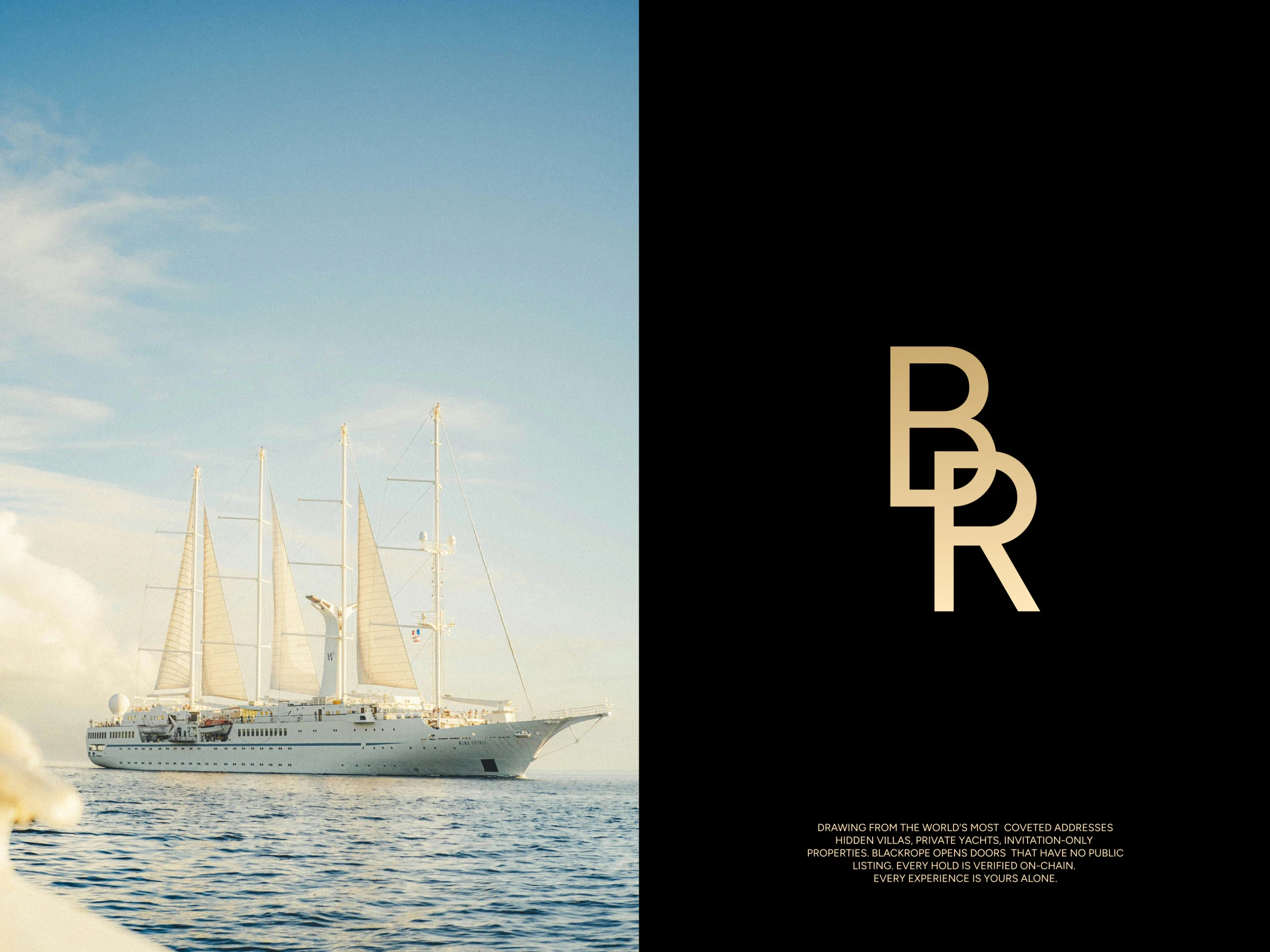
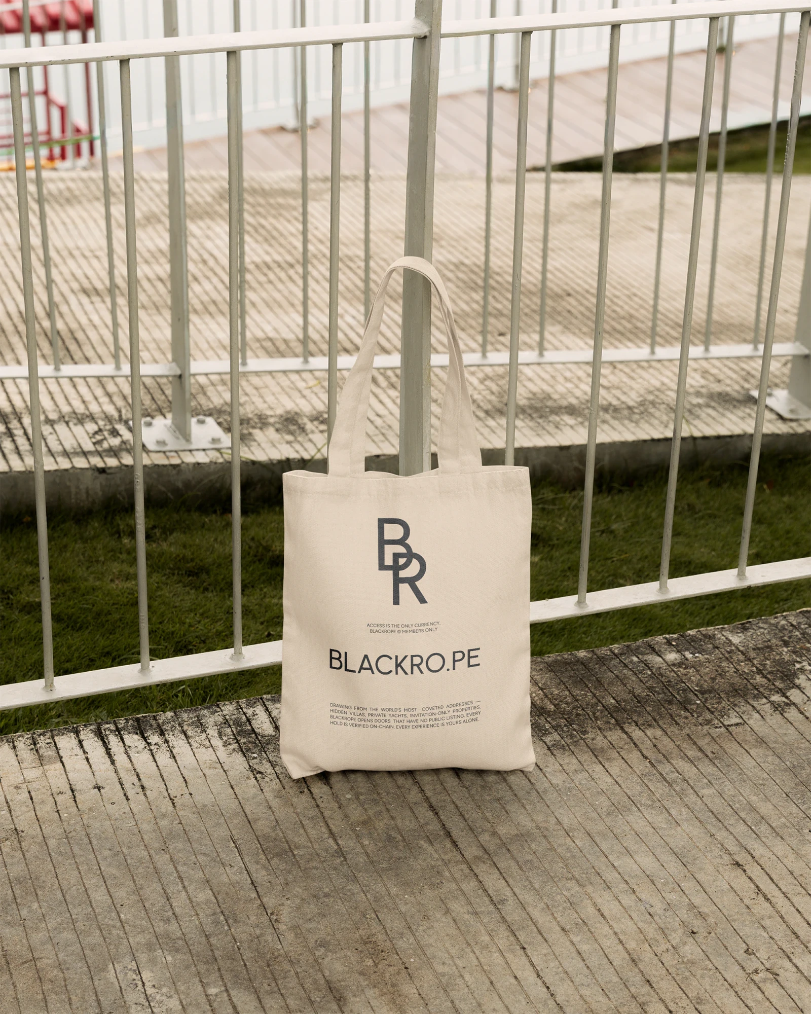
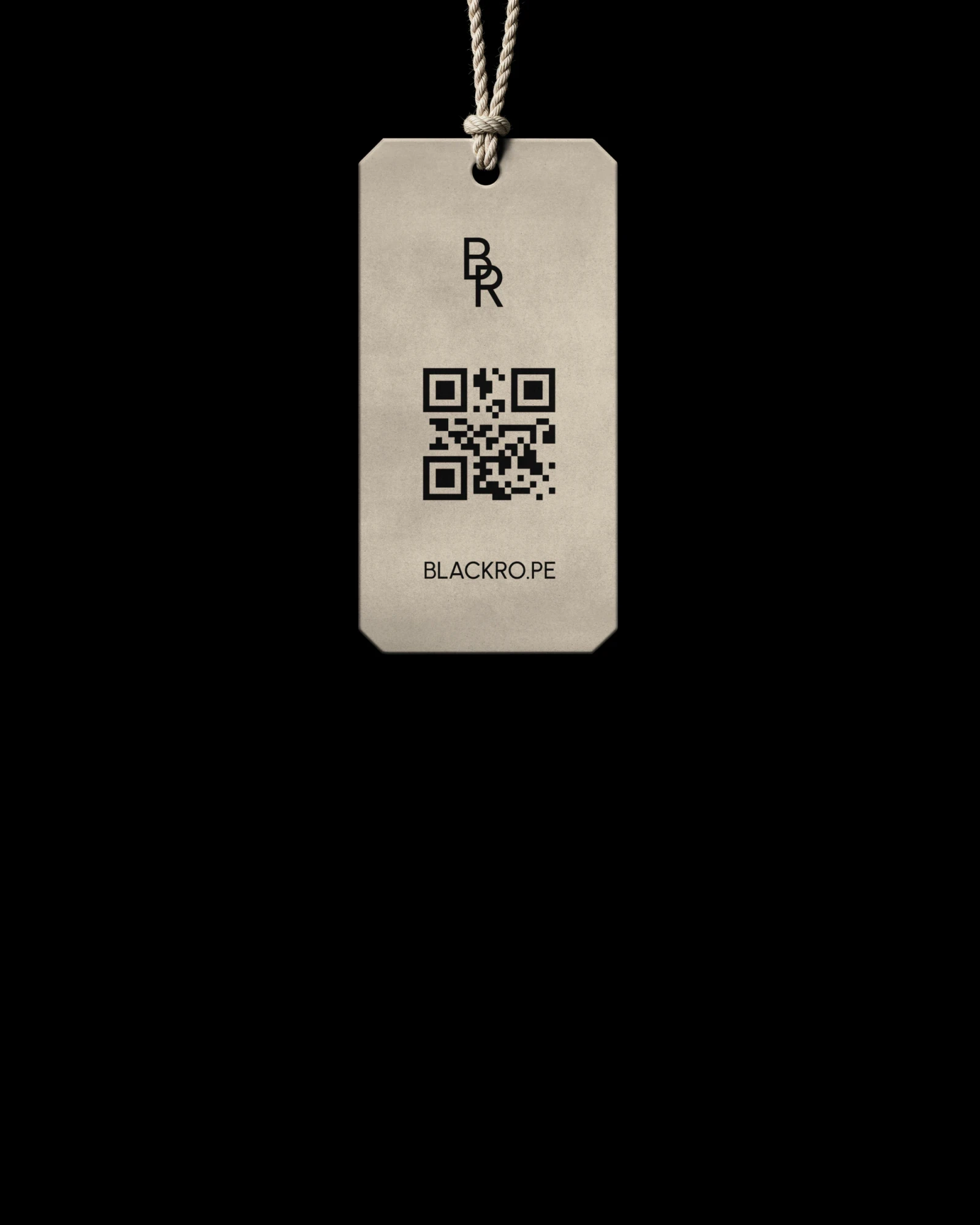
Concept three, the monogram: a geometric B and R that share a stroke, made to sit small on a tag or a key.
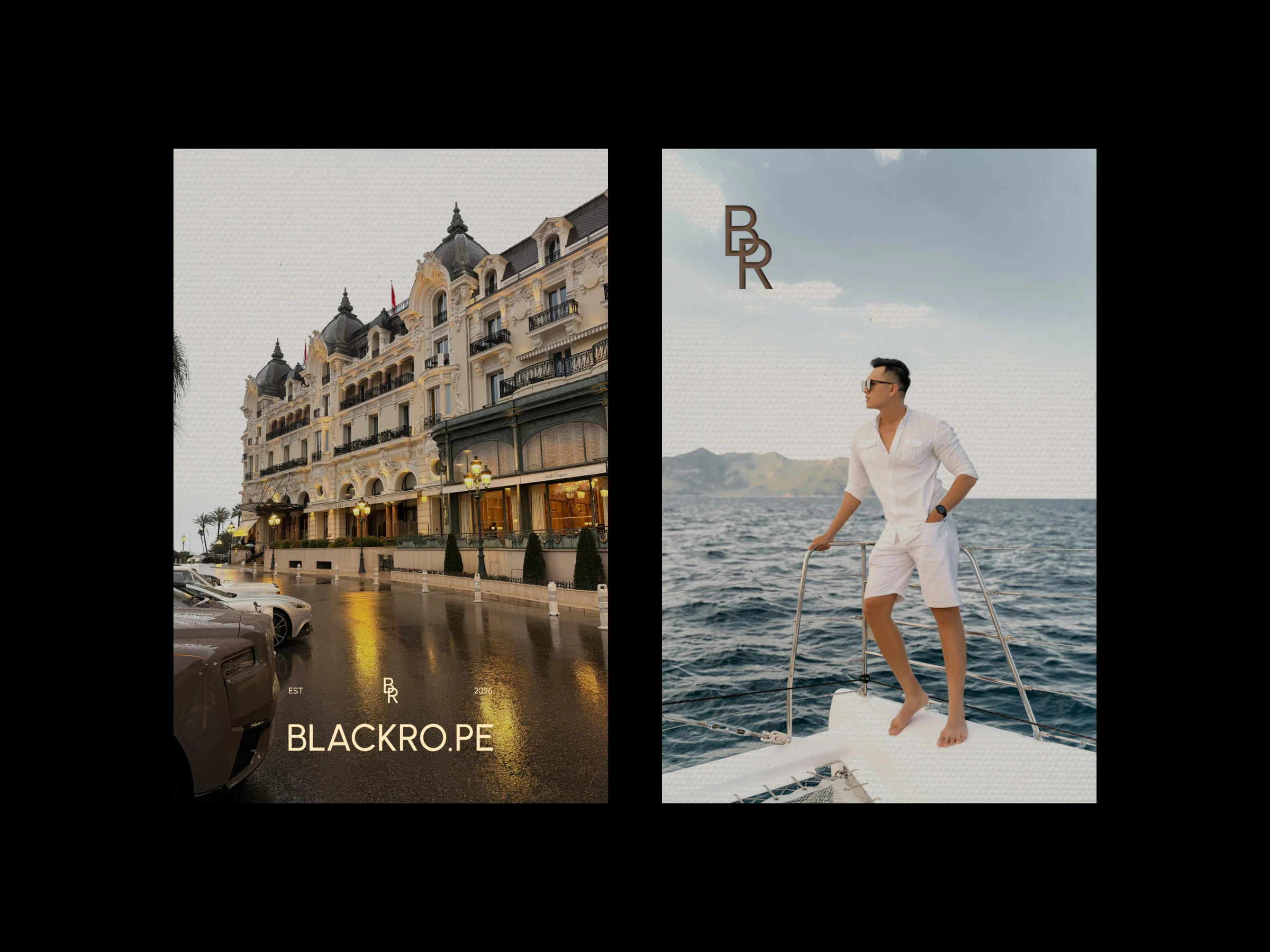
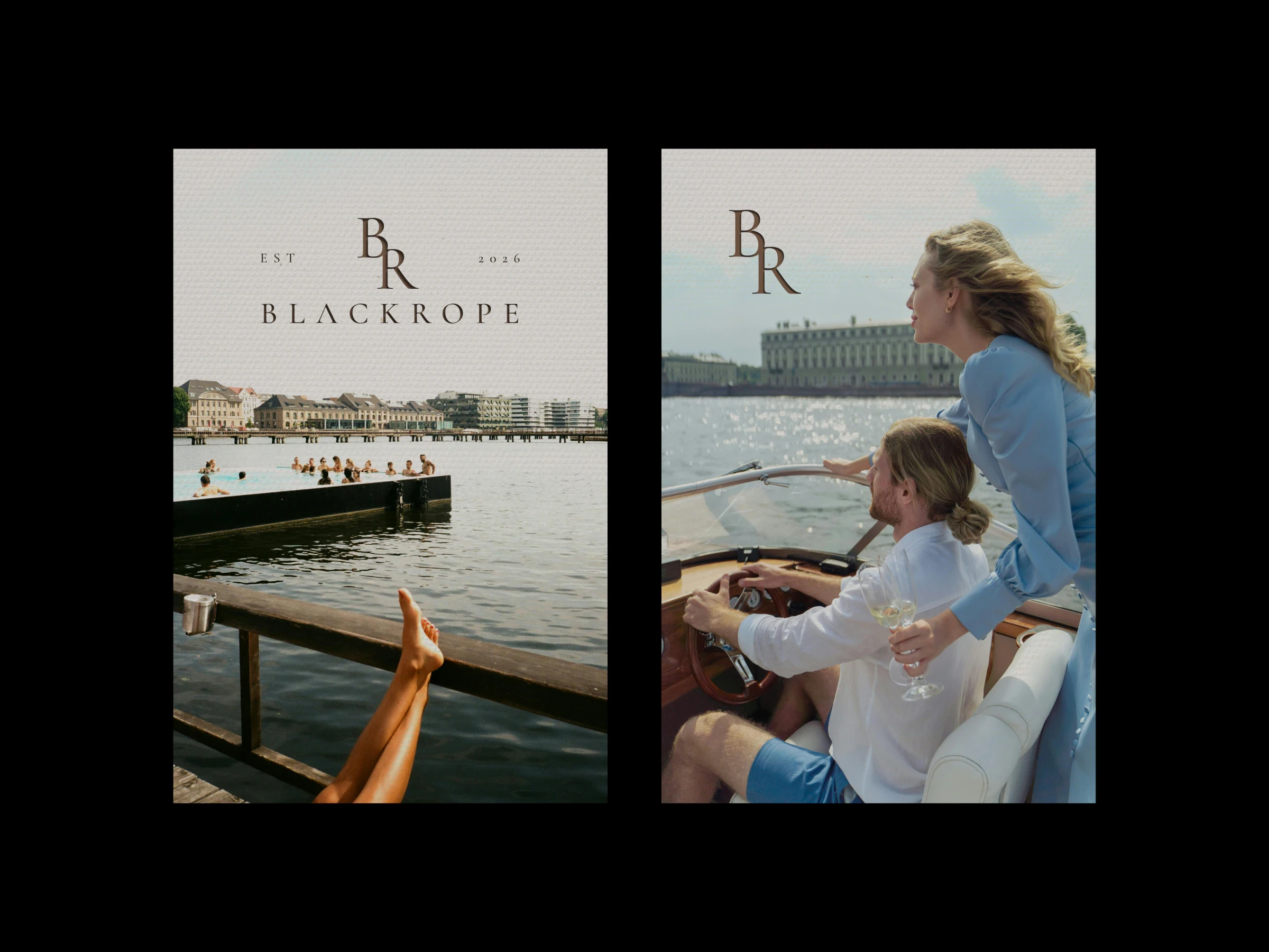
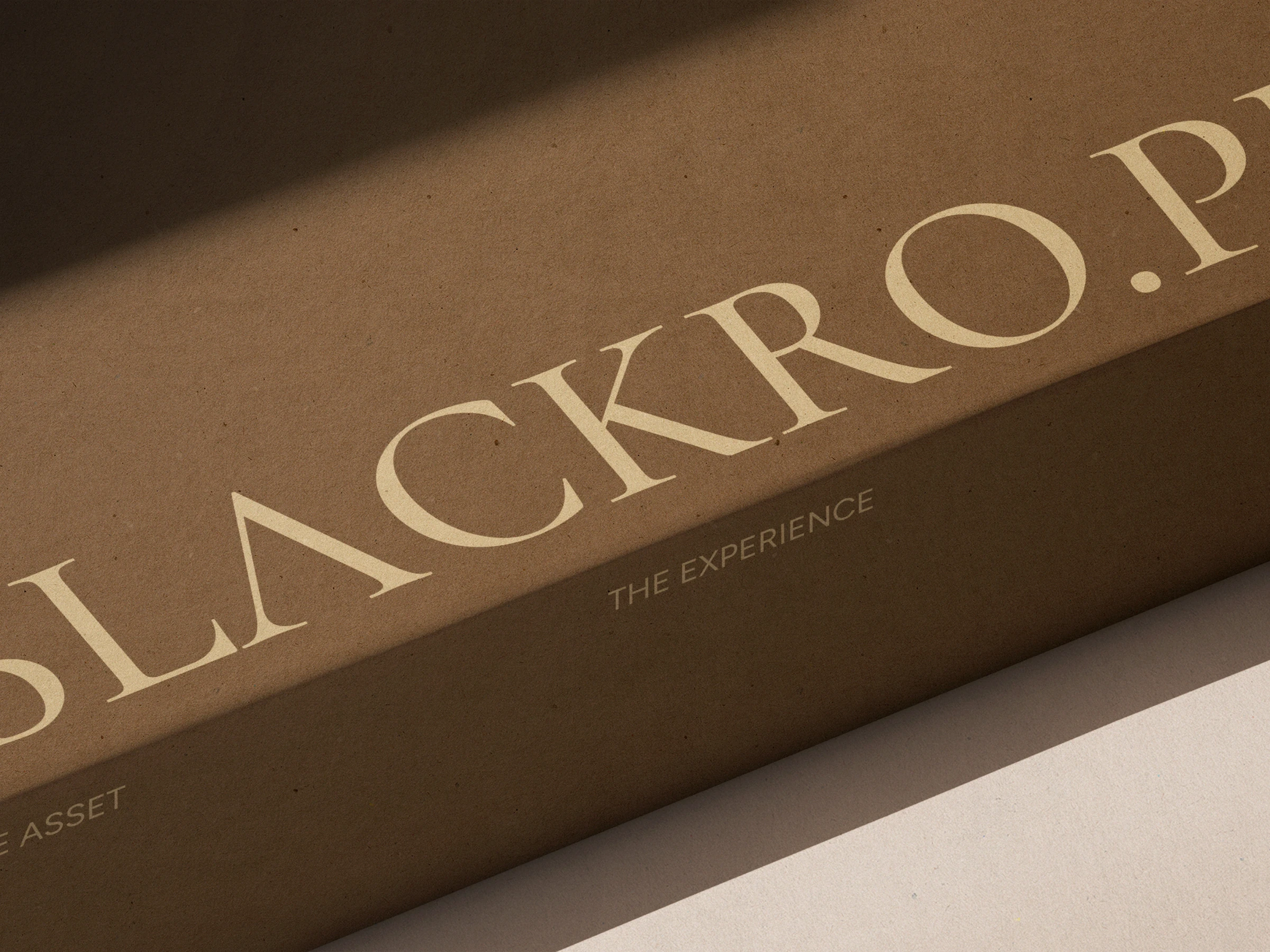
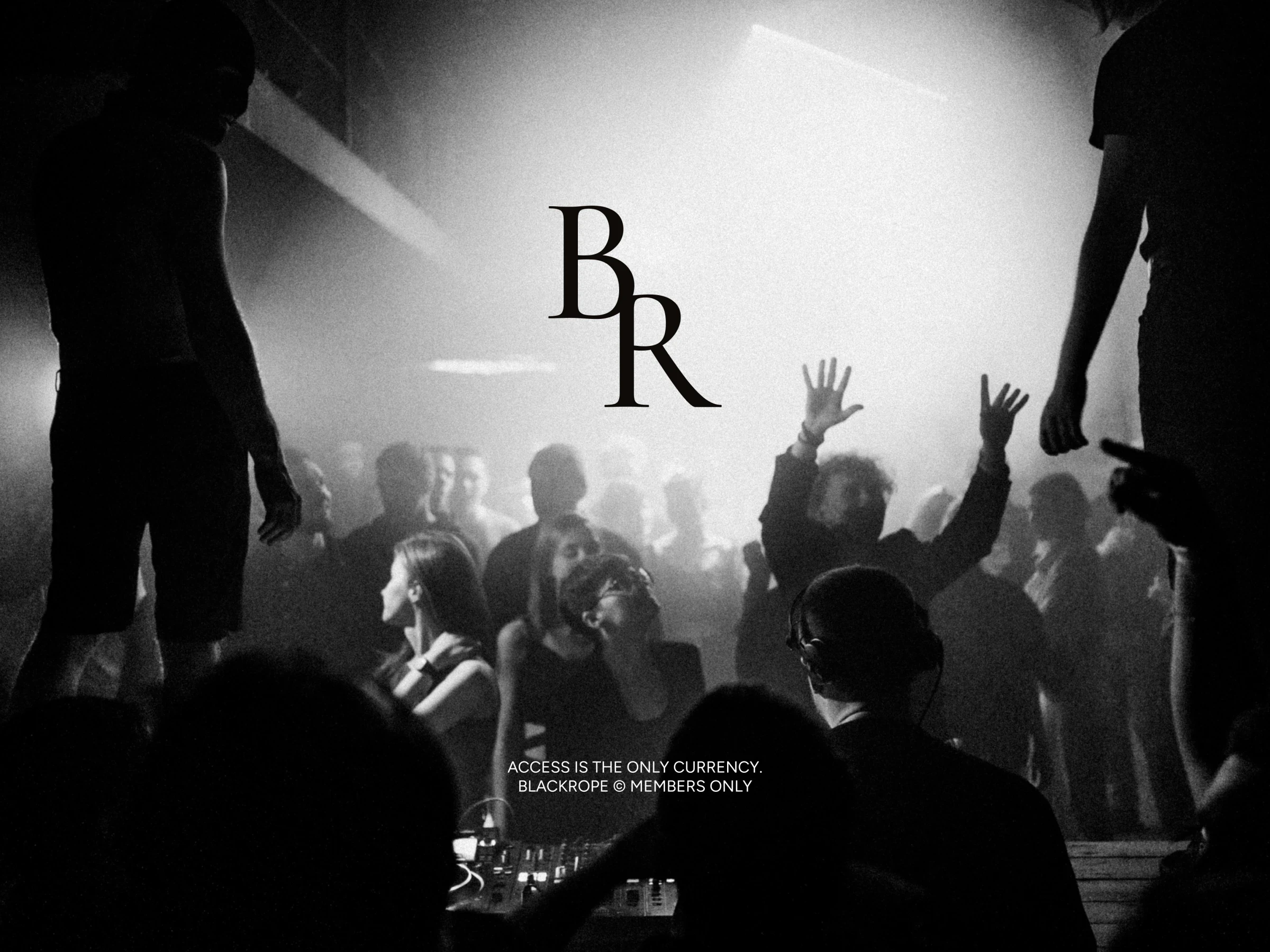
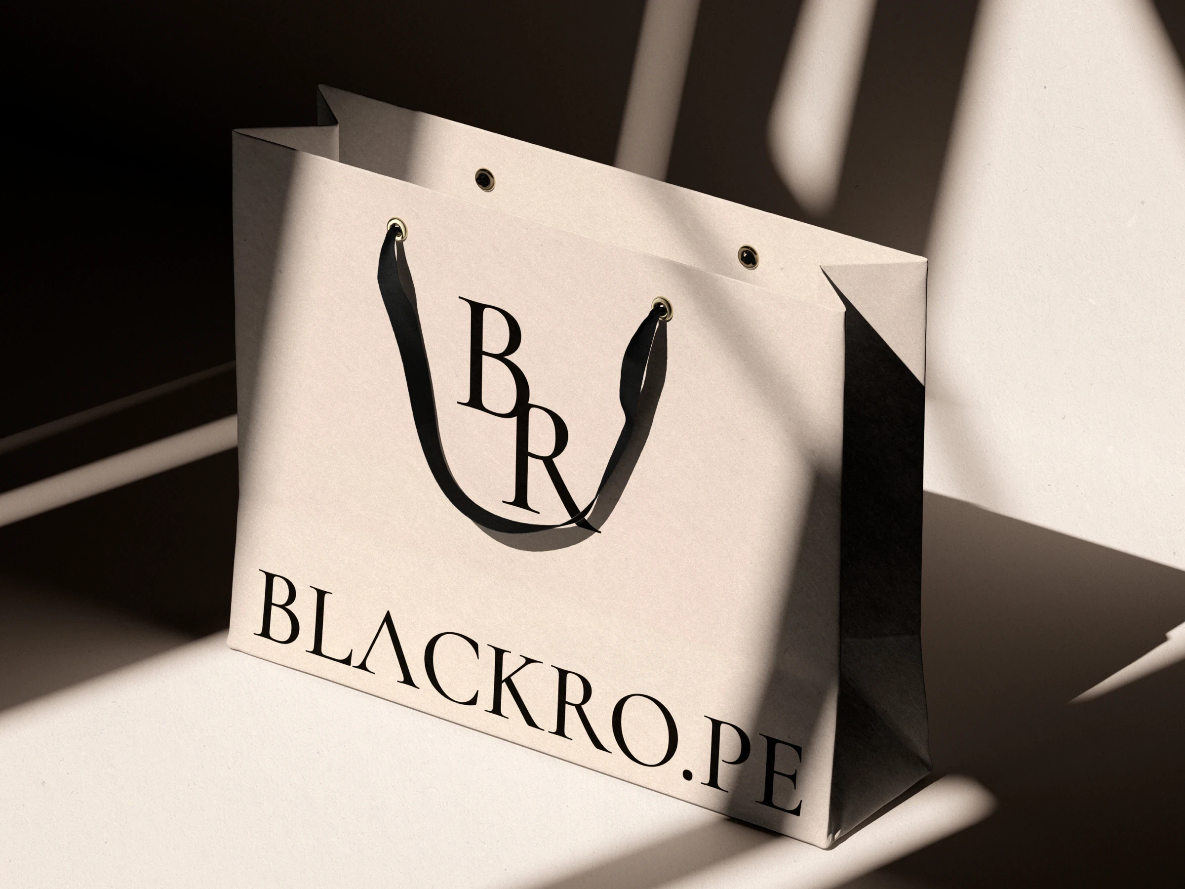
Concept four, the signature: a serif B stepping down into an R, with the ease of an old hotel crest.
- Client
- Blackrope
- Year
- 2026
- Services
- brand identity, logo design, art direction
Blackrope is a members-only platform for the kind of access money alone doesn’t buy: hidden villas, private yachts, invitation-only properties and nights. It opens doors that have no public listing, every booking is verified on-chain, and every experience belongs to the member alone. Its line says it plainly: Access is the only currency.
The name
A black rope is the line at the door: the one that separates the people who wait outside from the people who are let in. Set as BLACKRO.PE, the name gains a full stop that turns it into an address, a fitting shape for a door that opens online.
Four directions
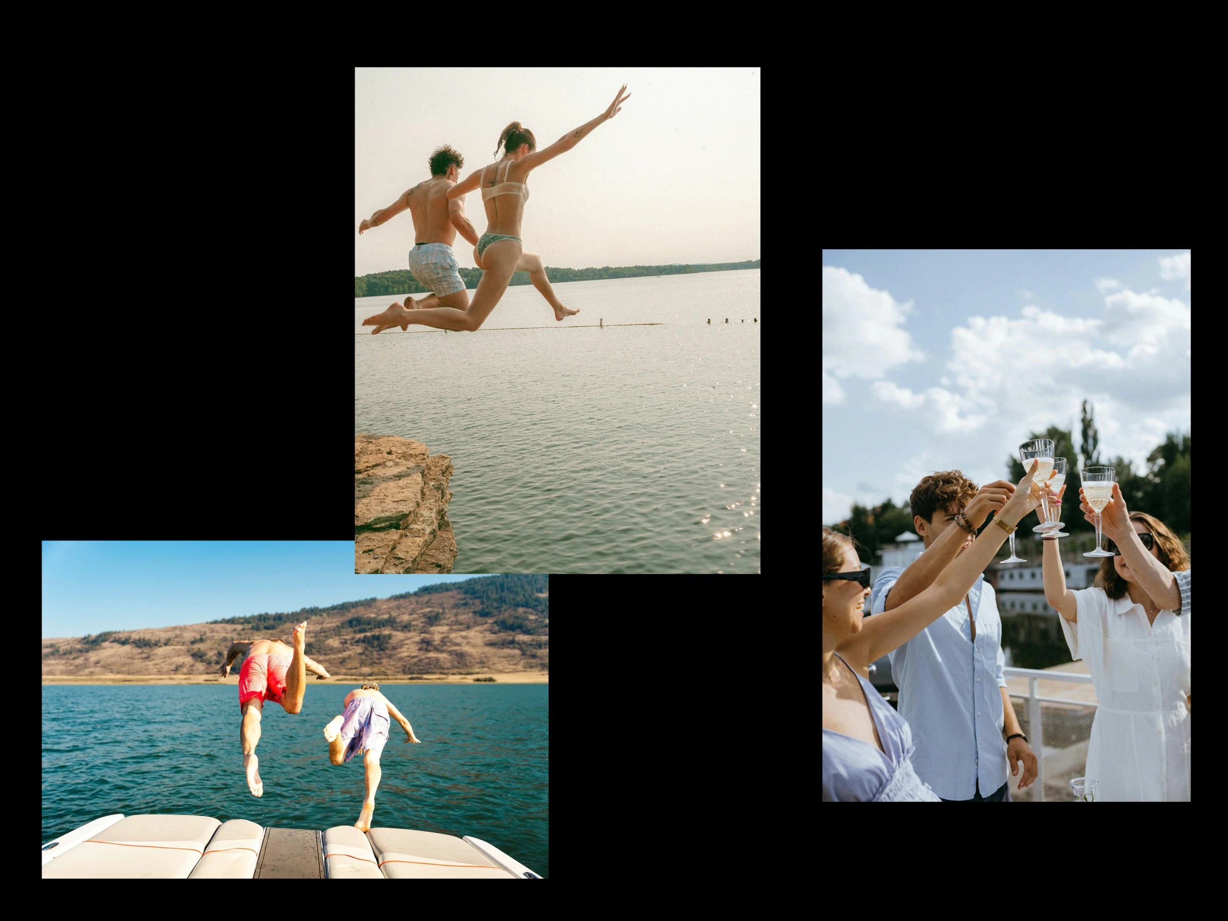
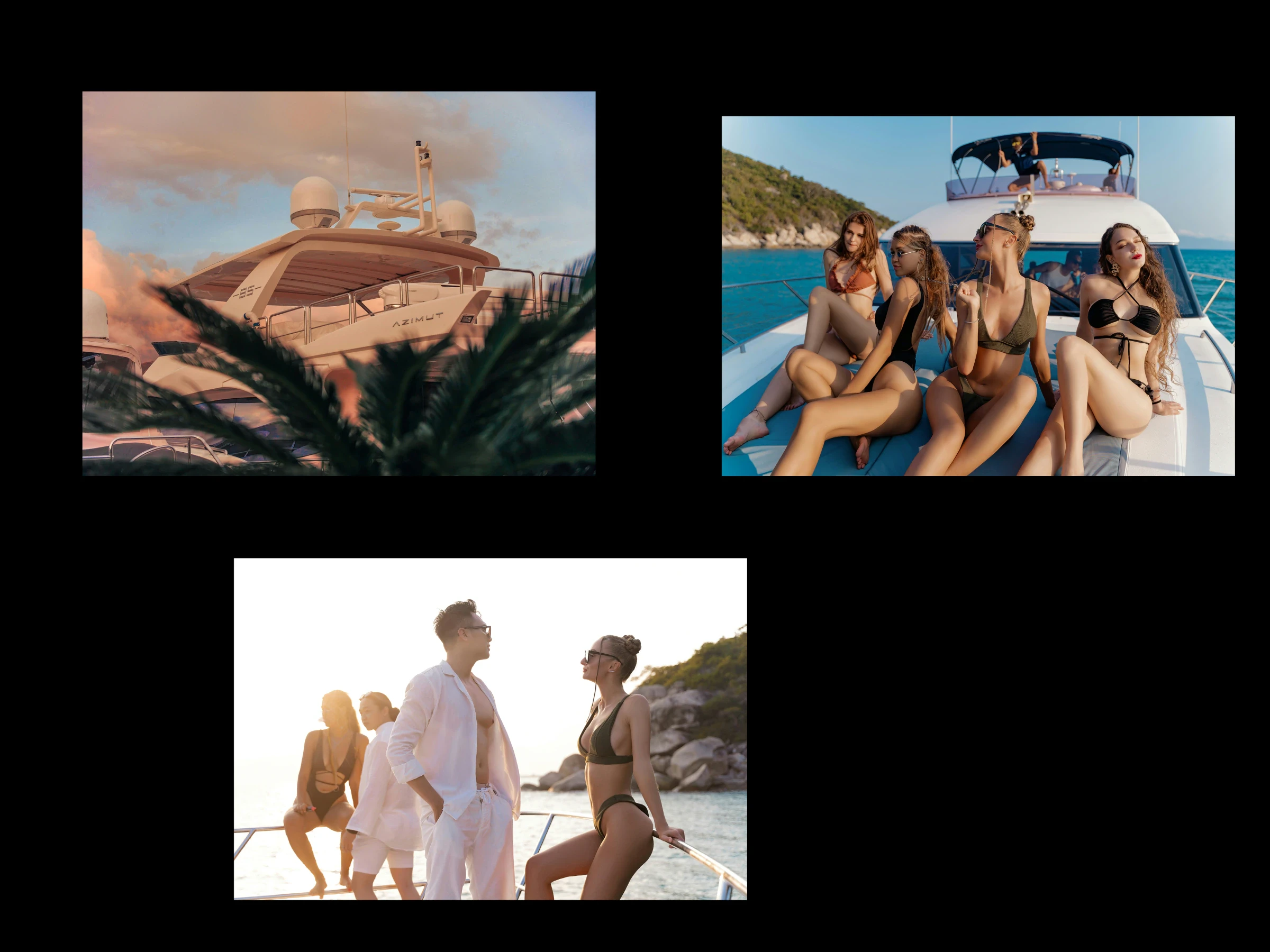
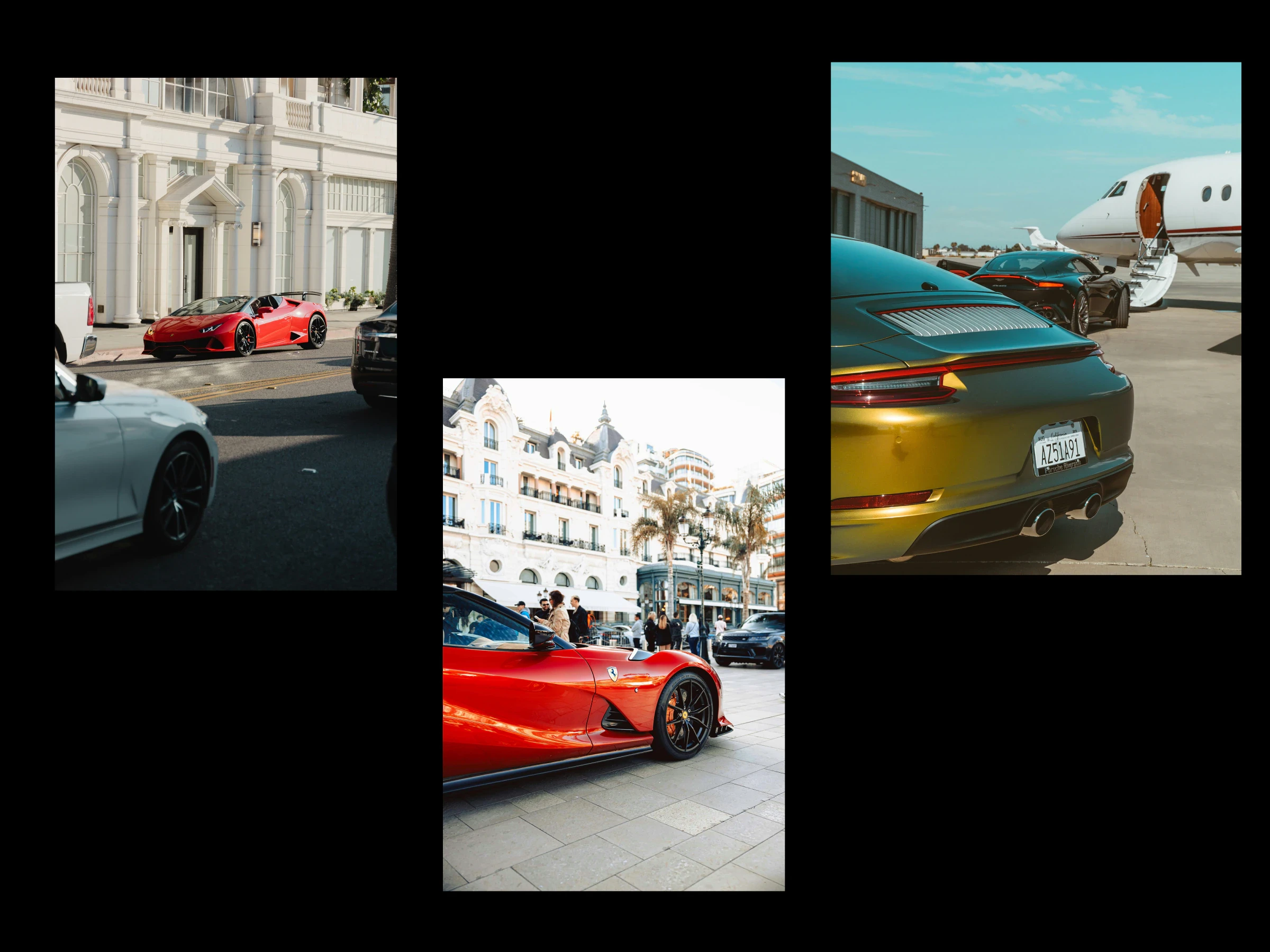
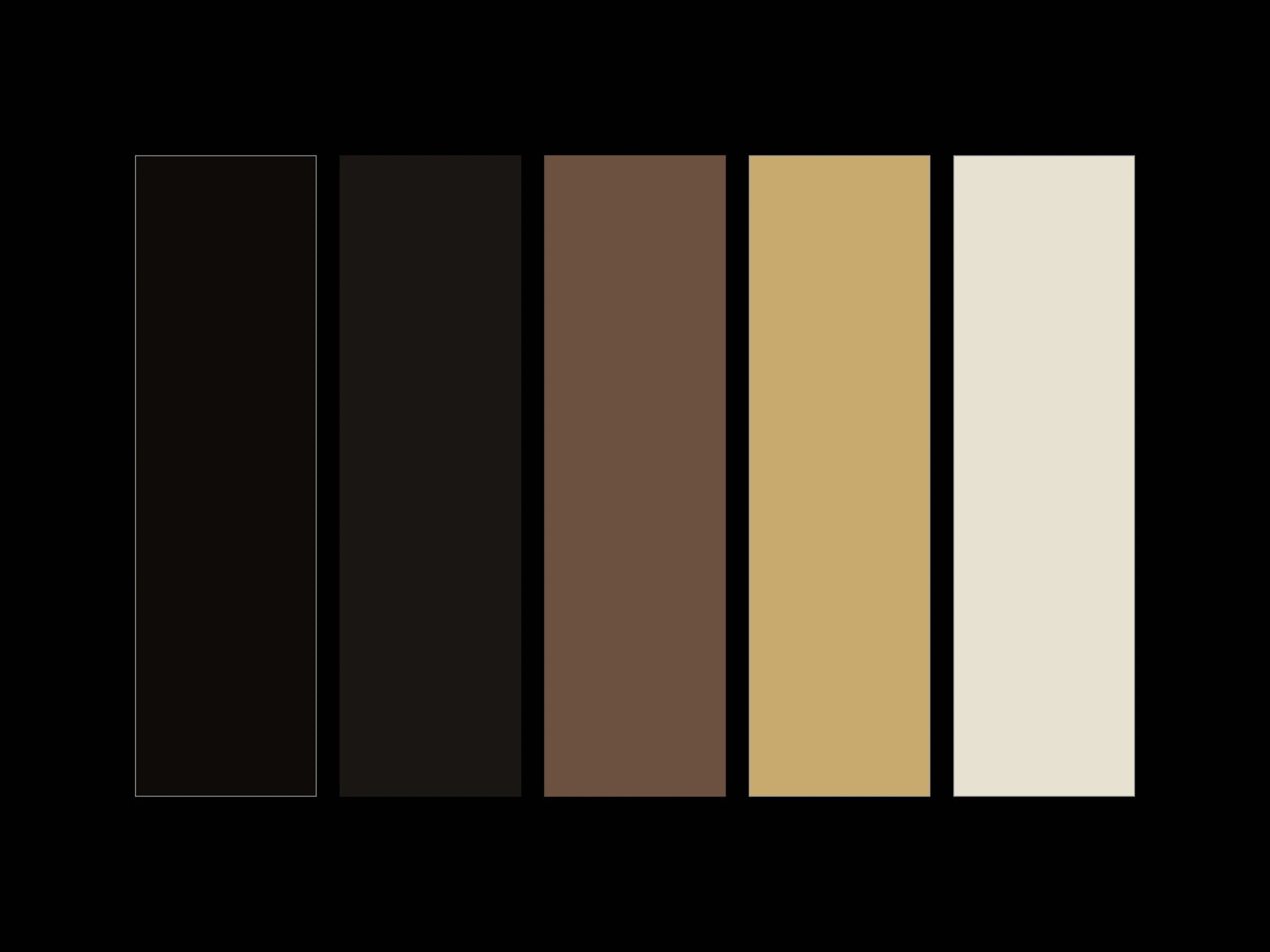
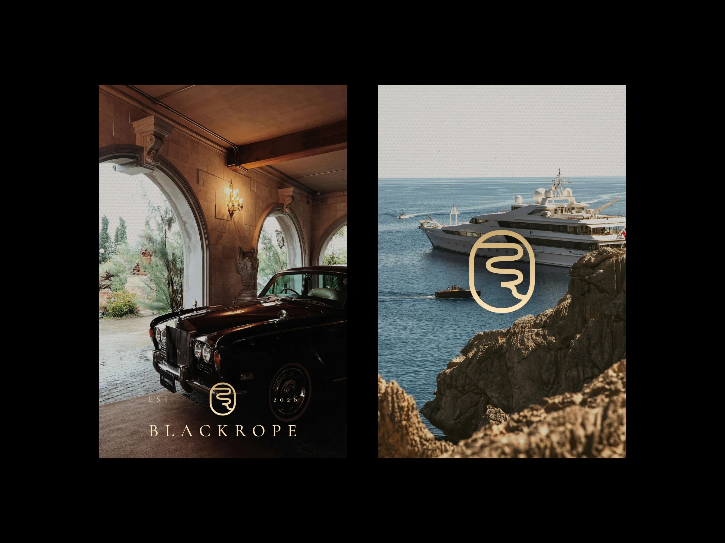
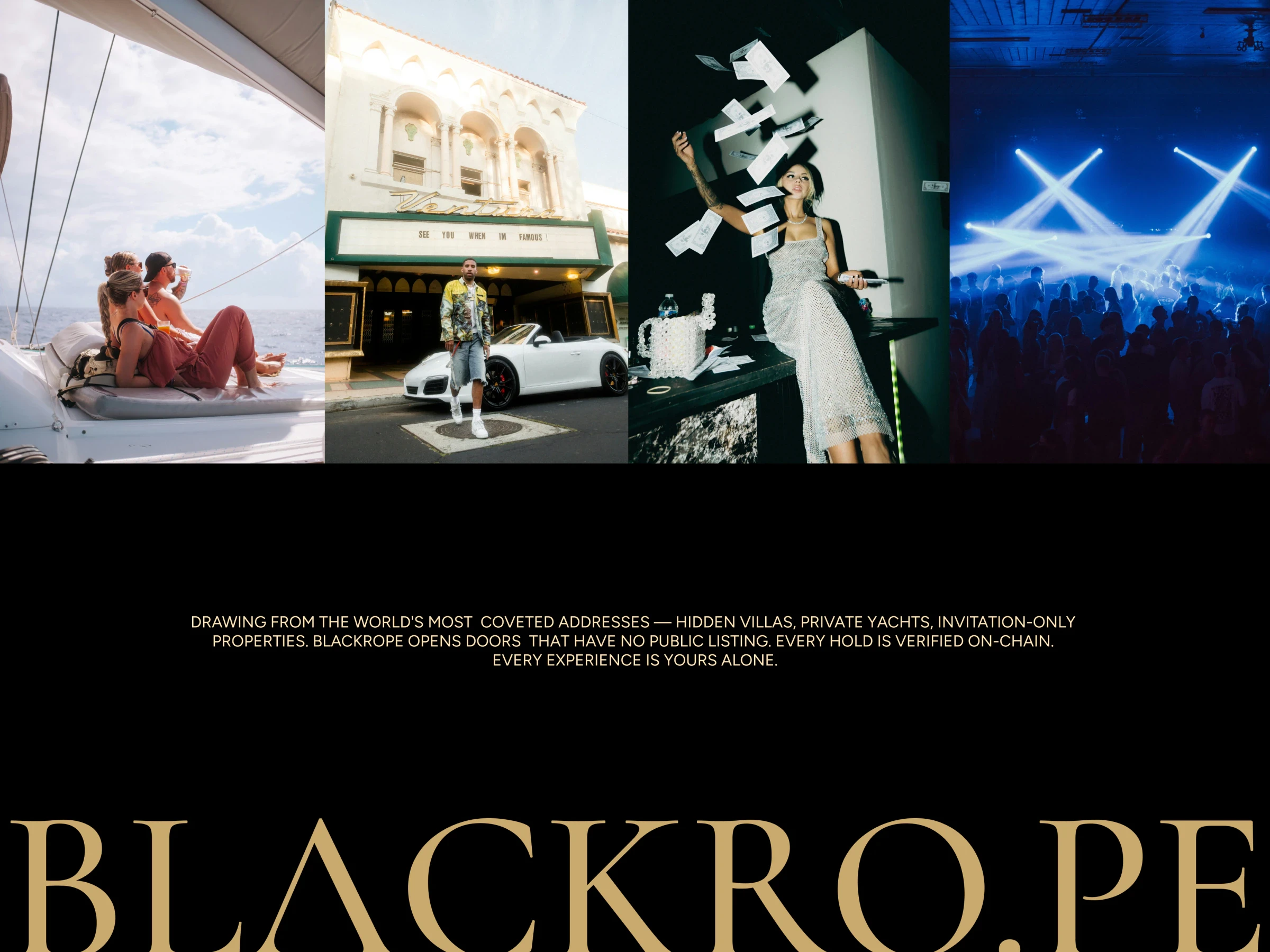
Rather than one answer, I explored and showcased four concepts, each with its own mark, wordmark and world. They share a palette of two blacks, a warm brown, gold and cream, and a moodboard of yachts, grand hotels and late nights.
The rope. A single line of rope is pulled into the initials B and R, then closed inside a rounded frame, like a doorway seen from the queue. Paired with a clean sans wordmark, it is the most modern of the four.
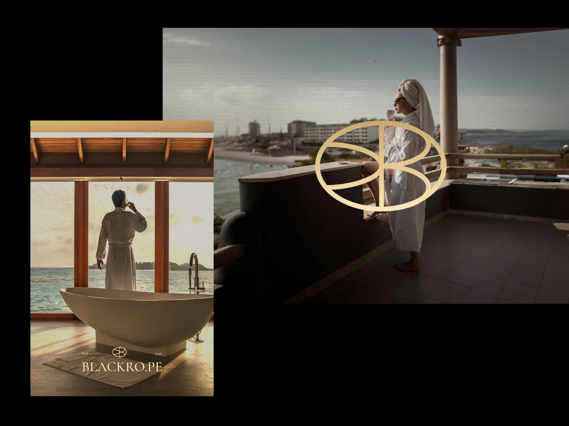
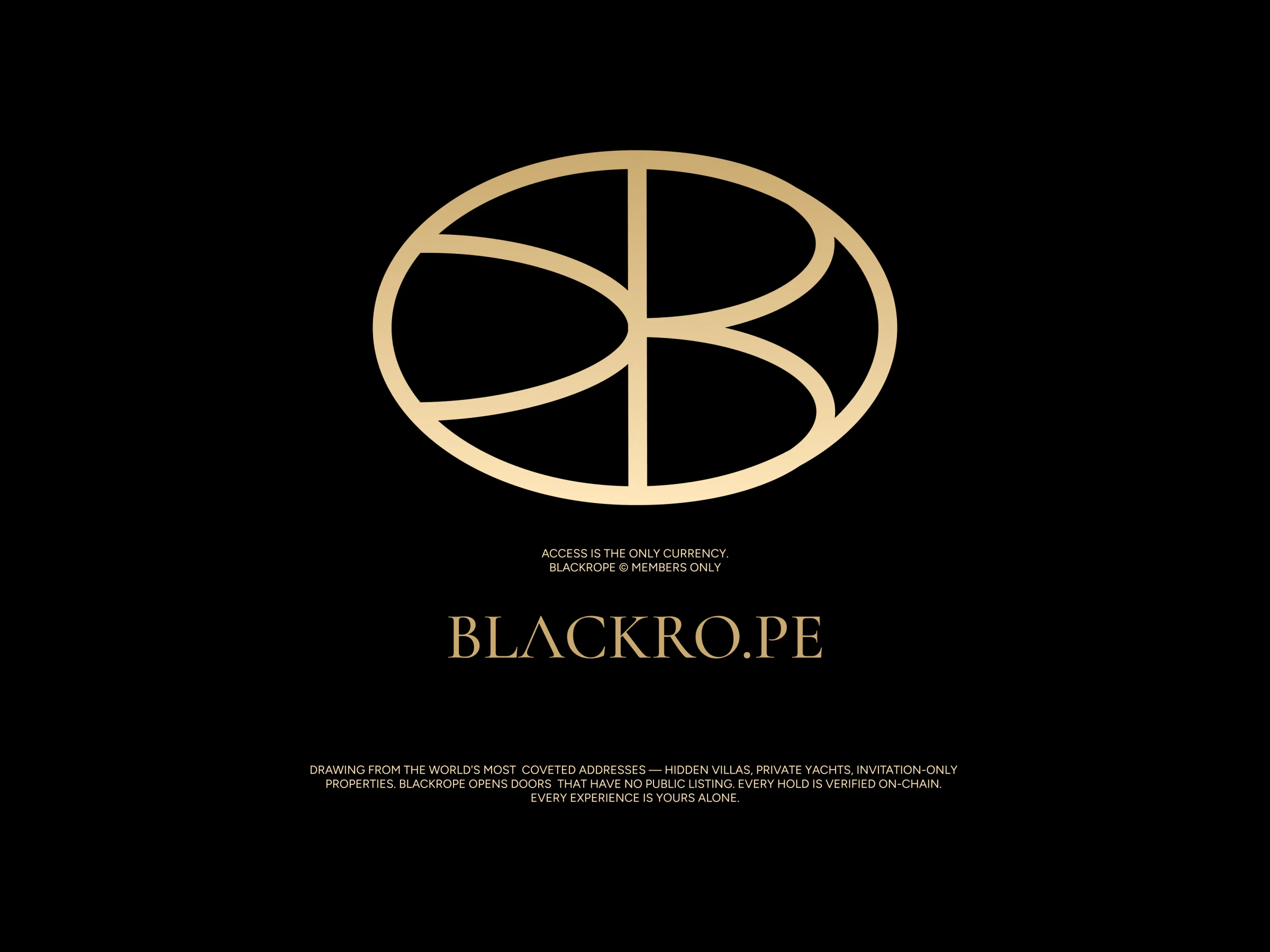
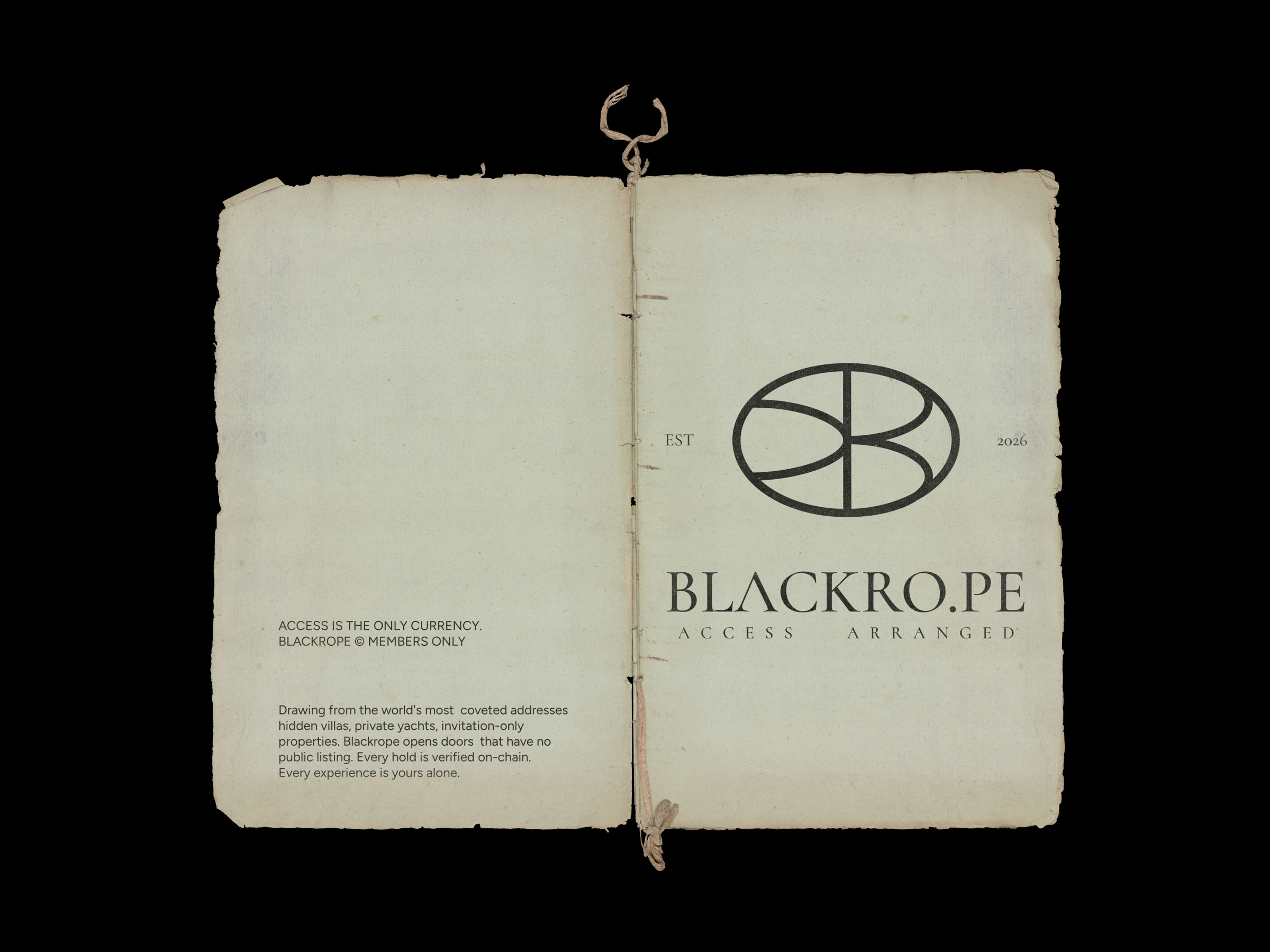
The seal. A B and its mirror image fold into an oval. It reads as a monogram, a crest and a wax seal at once, and comes alive when it is pressed into paper.
The monogram. A geometric B and R share a stroke and lock together. Small and sharp, it was built for tags, keys and the corner of a screen.
The signature. A serif B steps down into an R, with the calm of an old hotel crest. Set with a widely spaced serif wordmark, it is the quietest and most classic direction.
In use
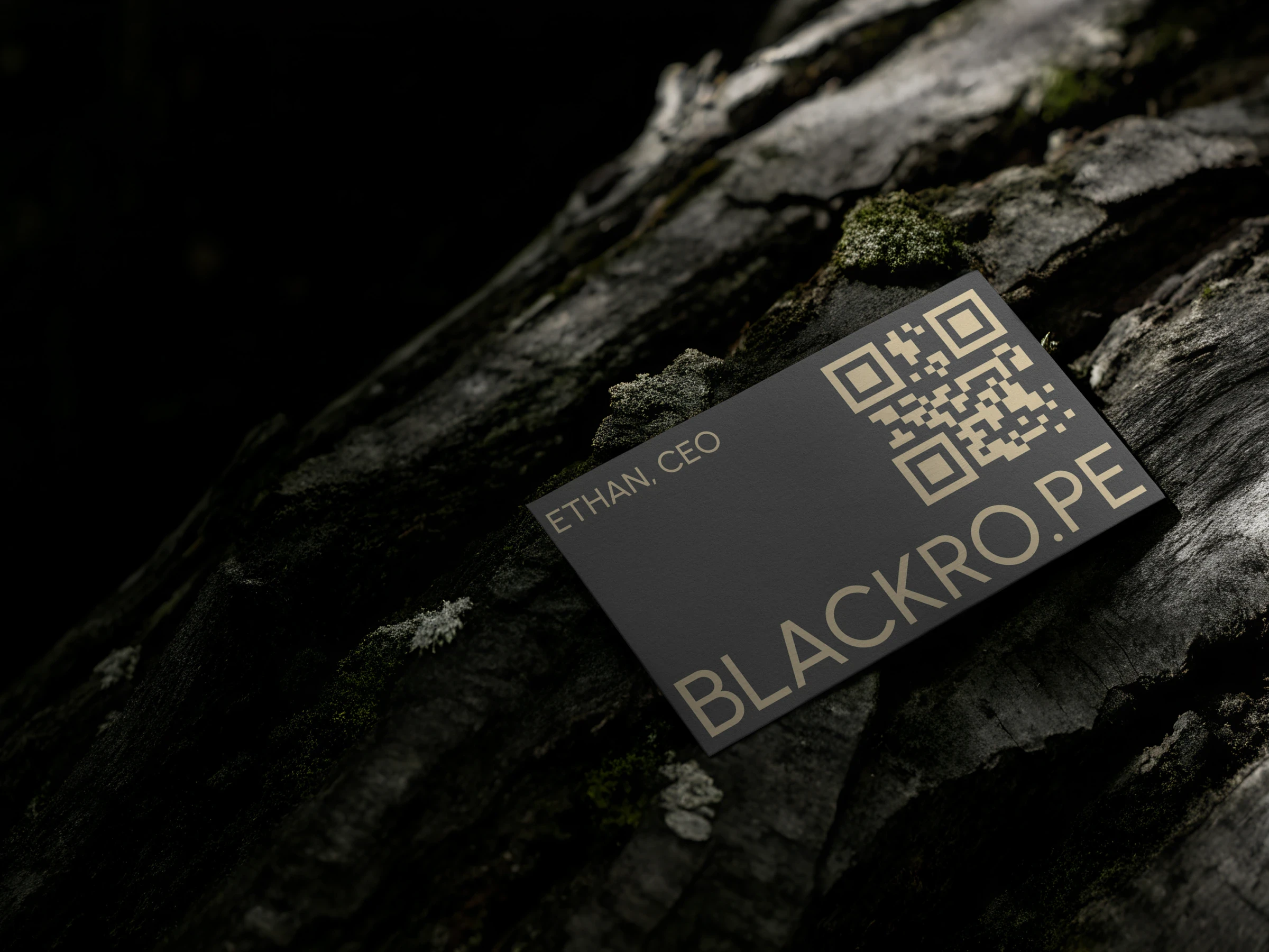
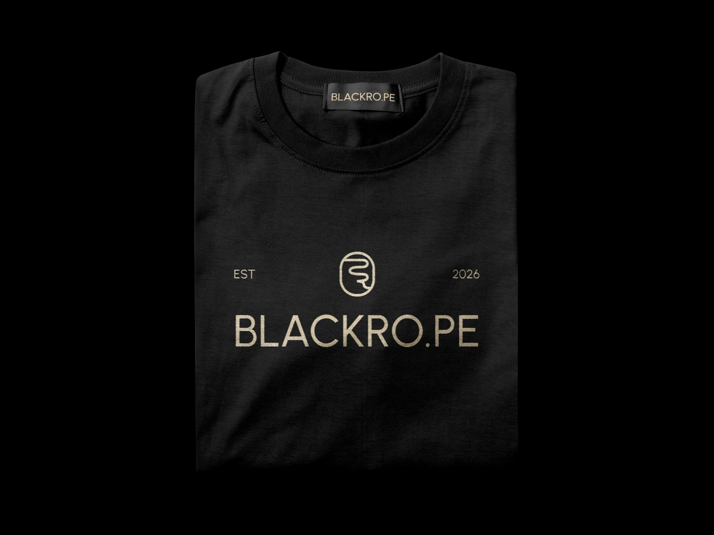
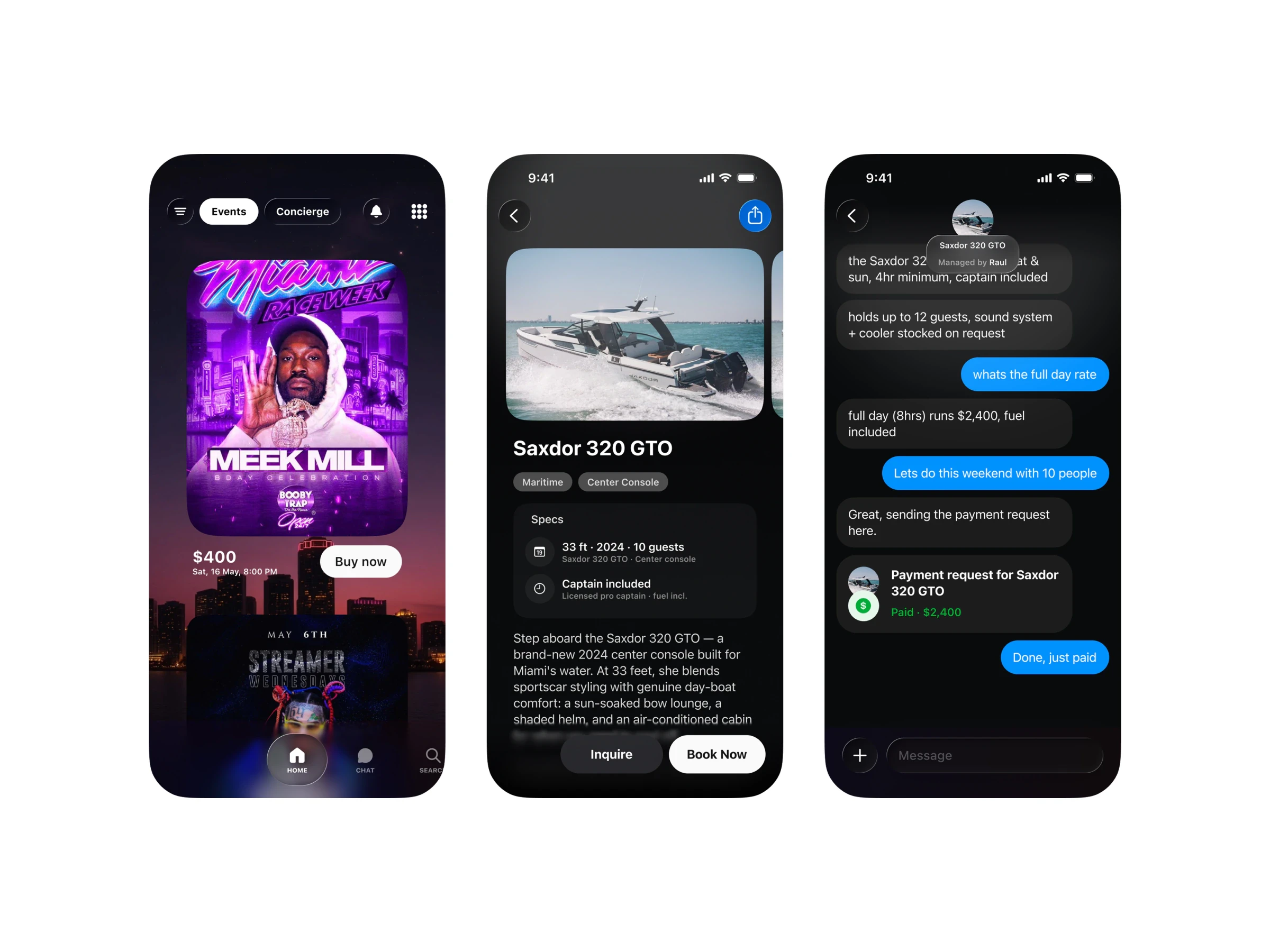
Each concept was shown where members would actually meet it: shopping bags, business cards with QR keys, embossed paper, hang tags, posters, merchandise, and the app where members book events and yachts and talk to their concierge.