OpenTag
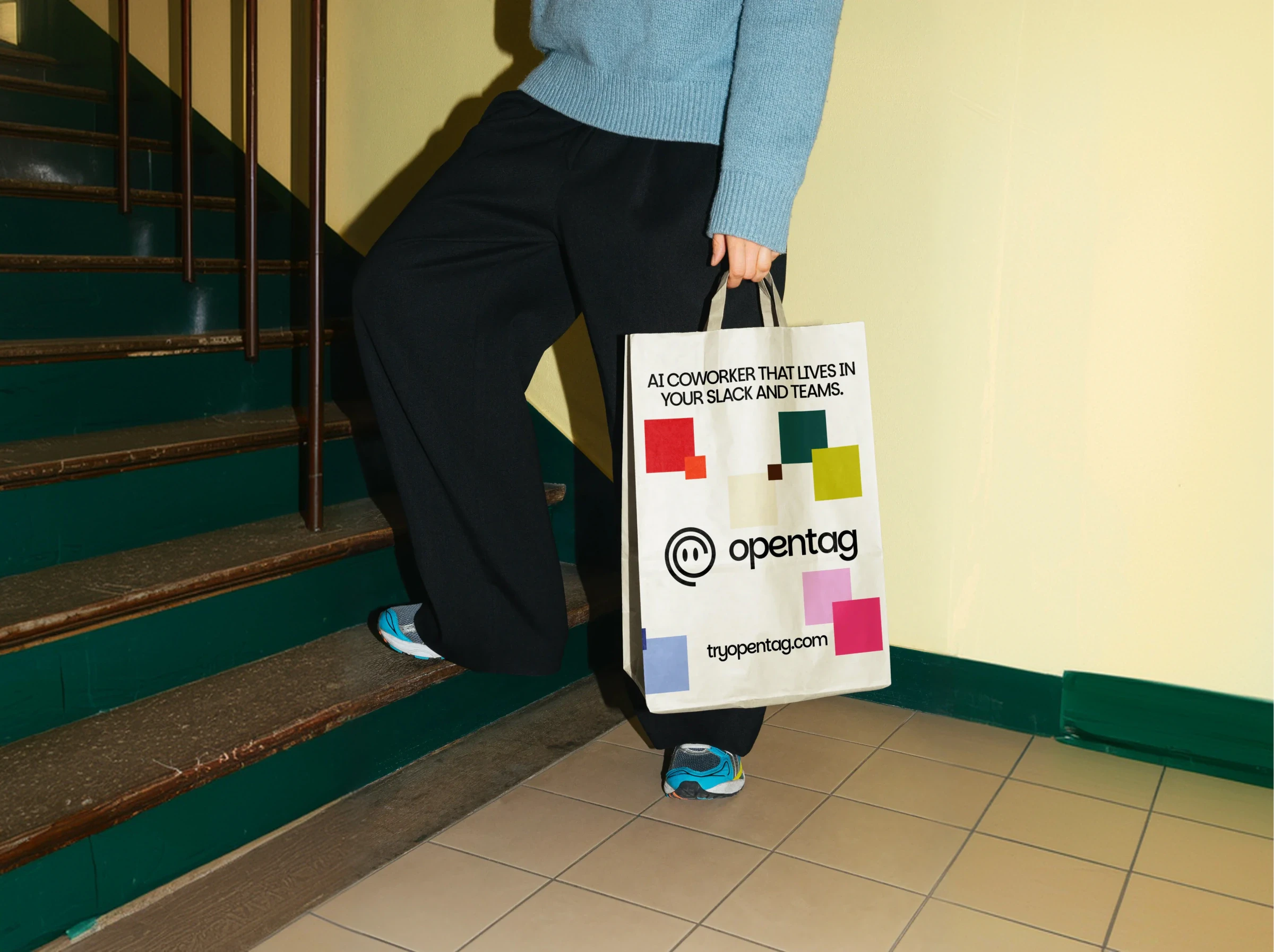
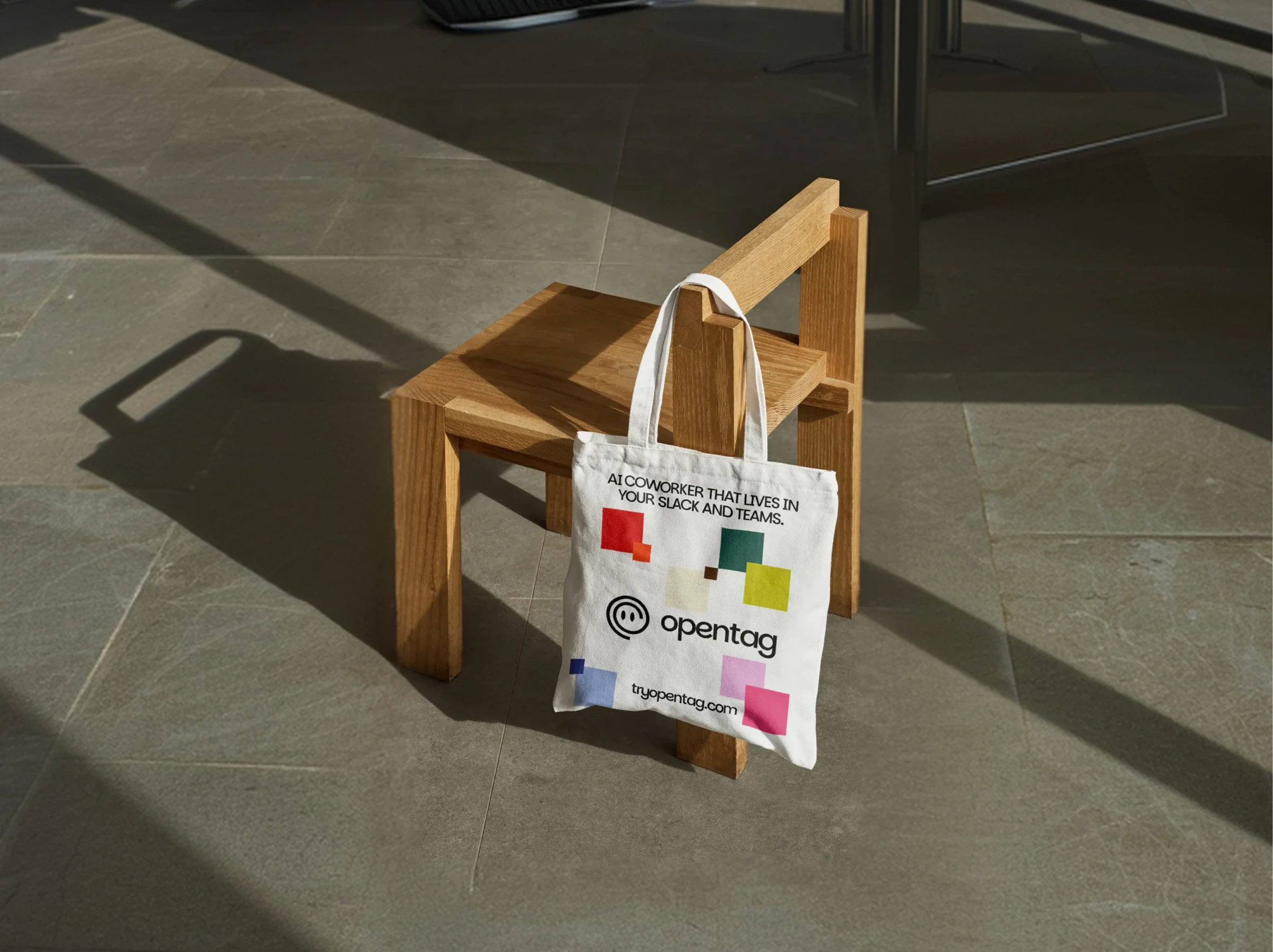
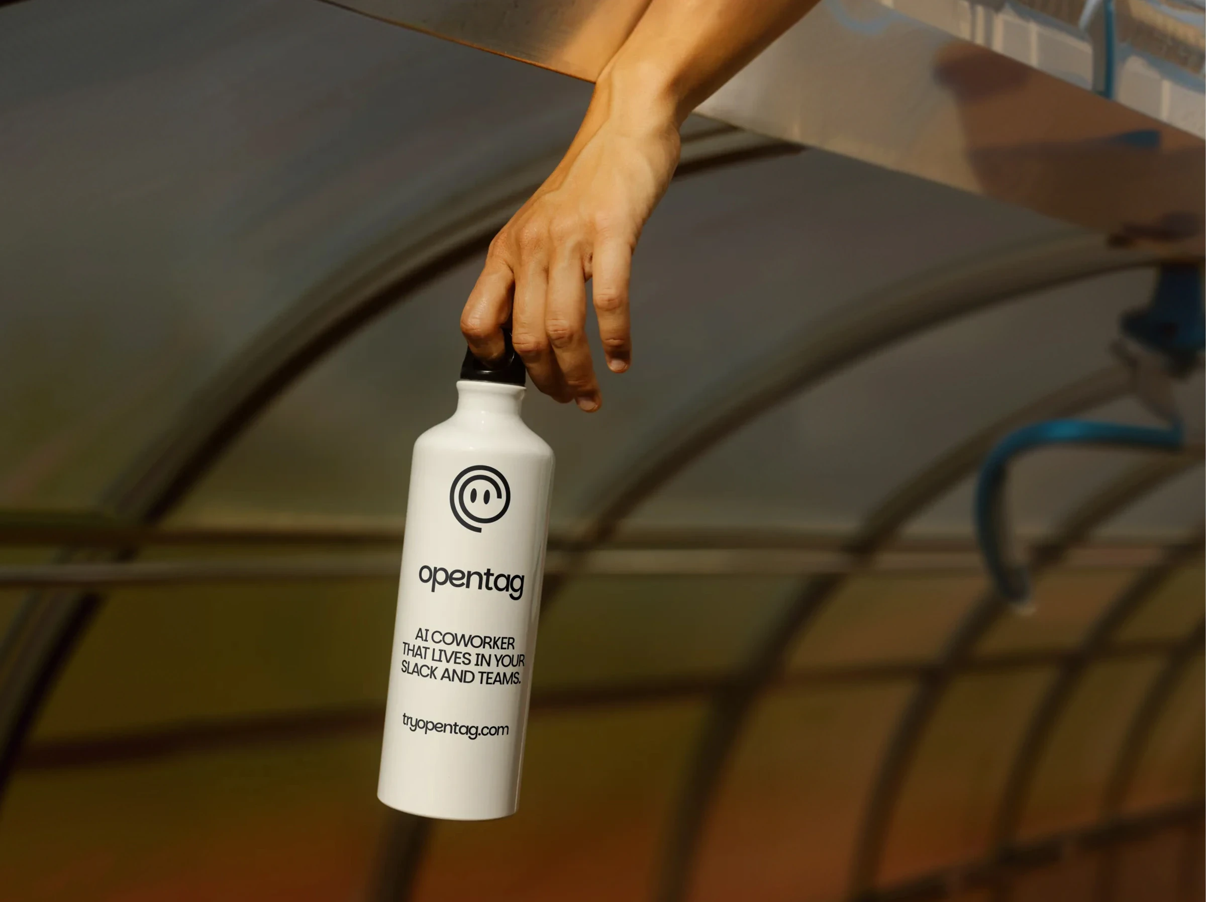
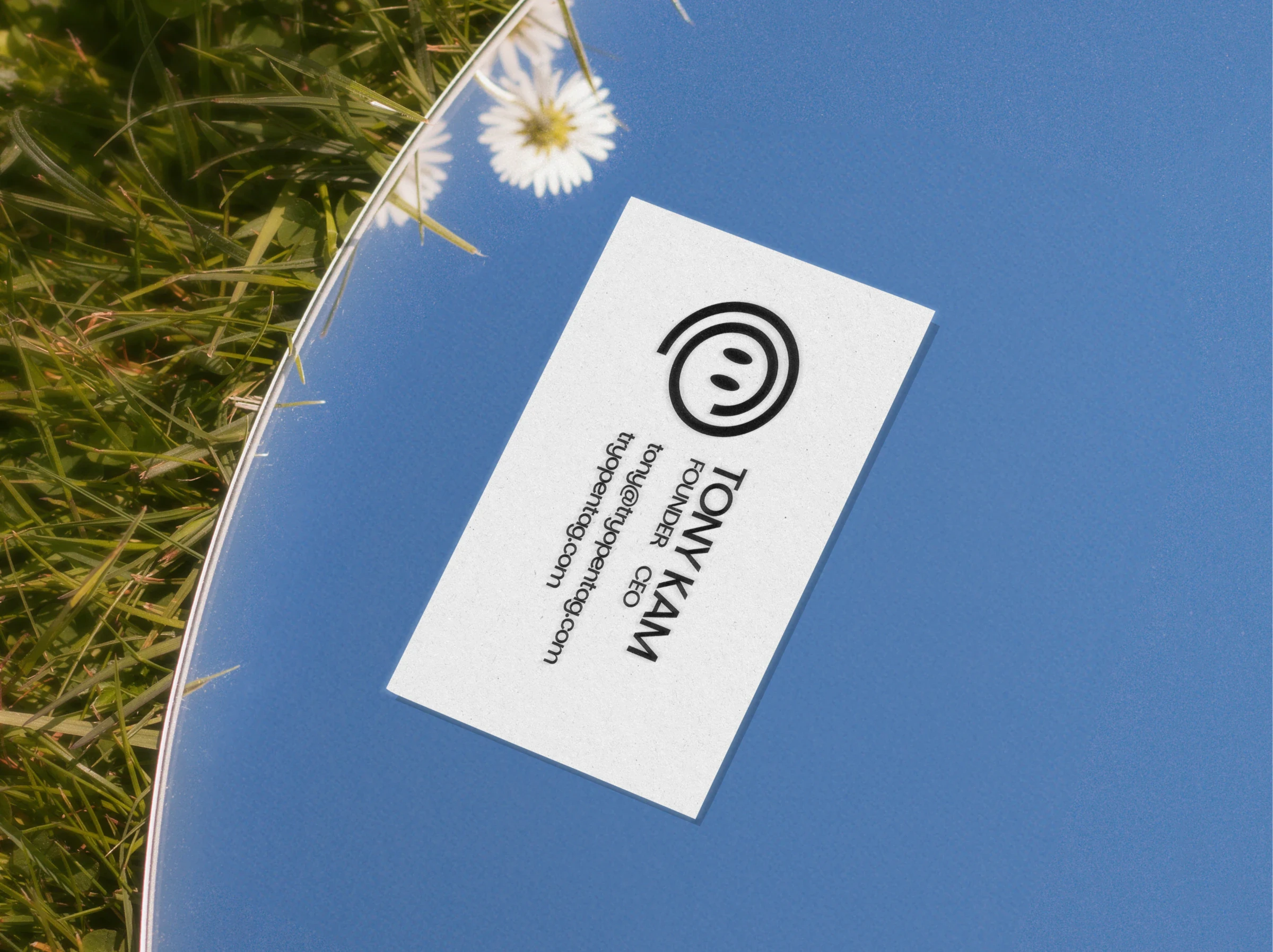
Concept identity for a Slack AI coworker that puts 80 models one @ away. An unsolicited rebrand for the YC-backed startup.
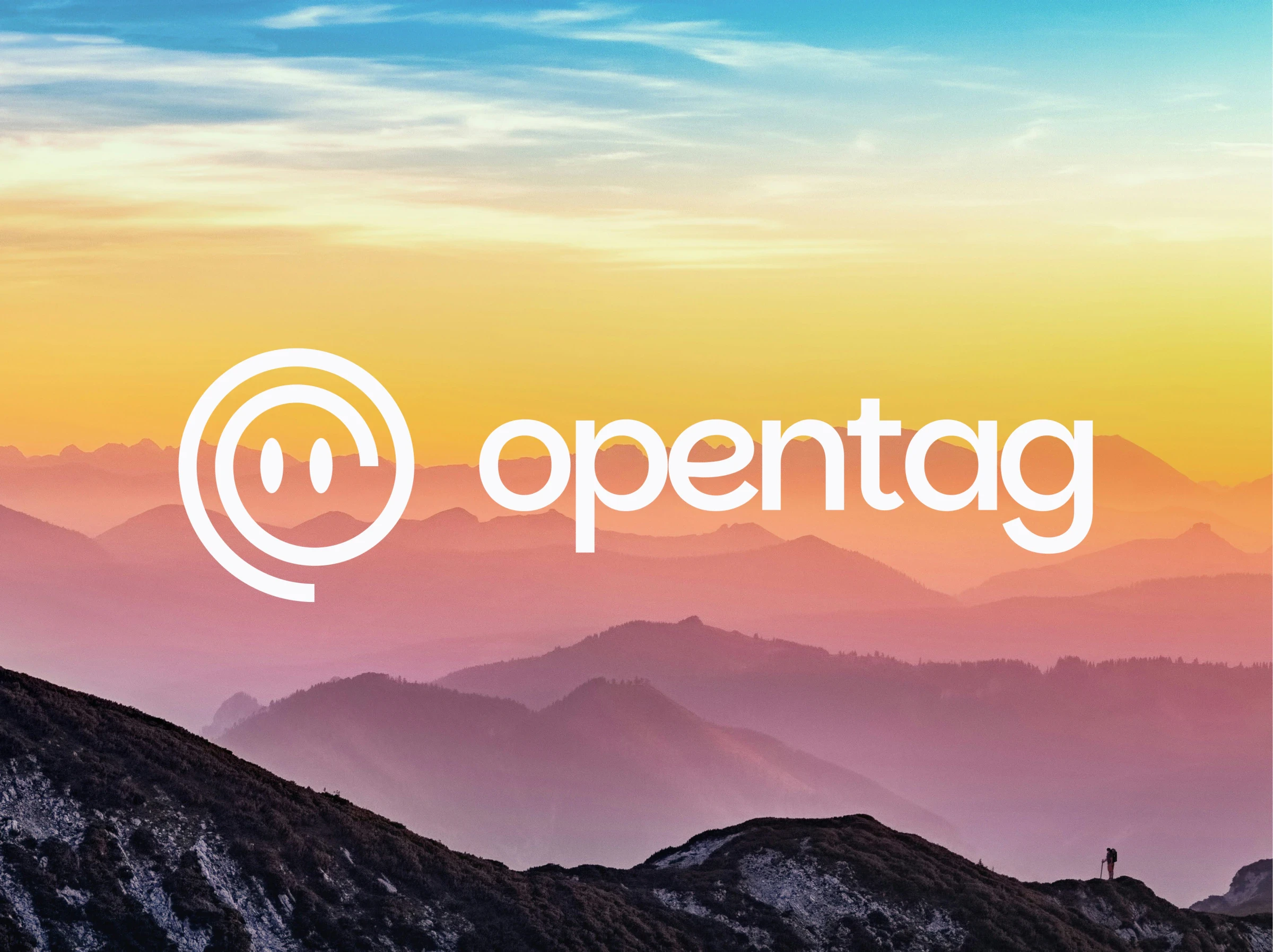
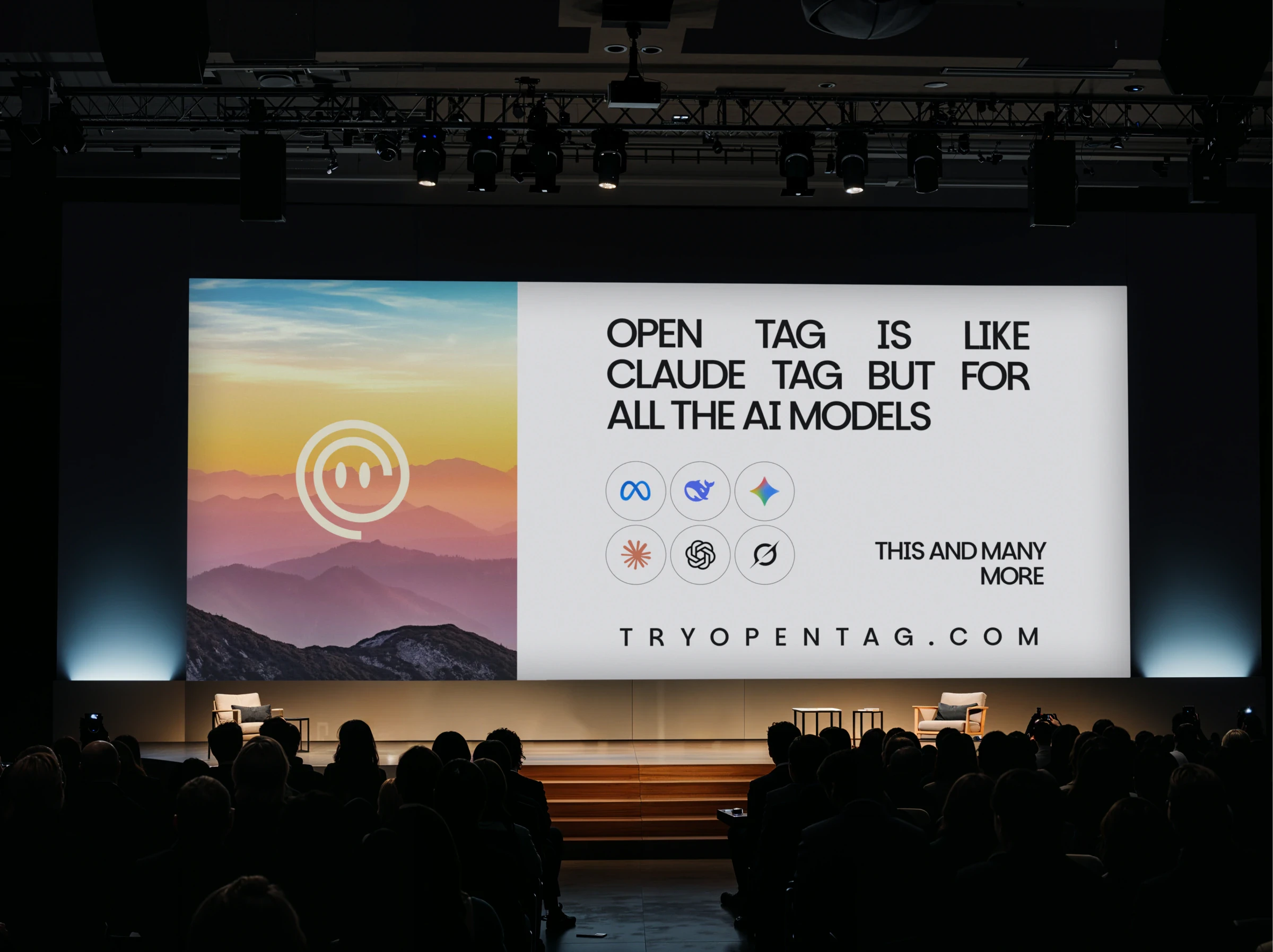
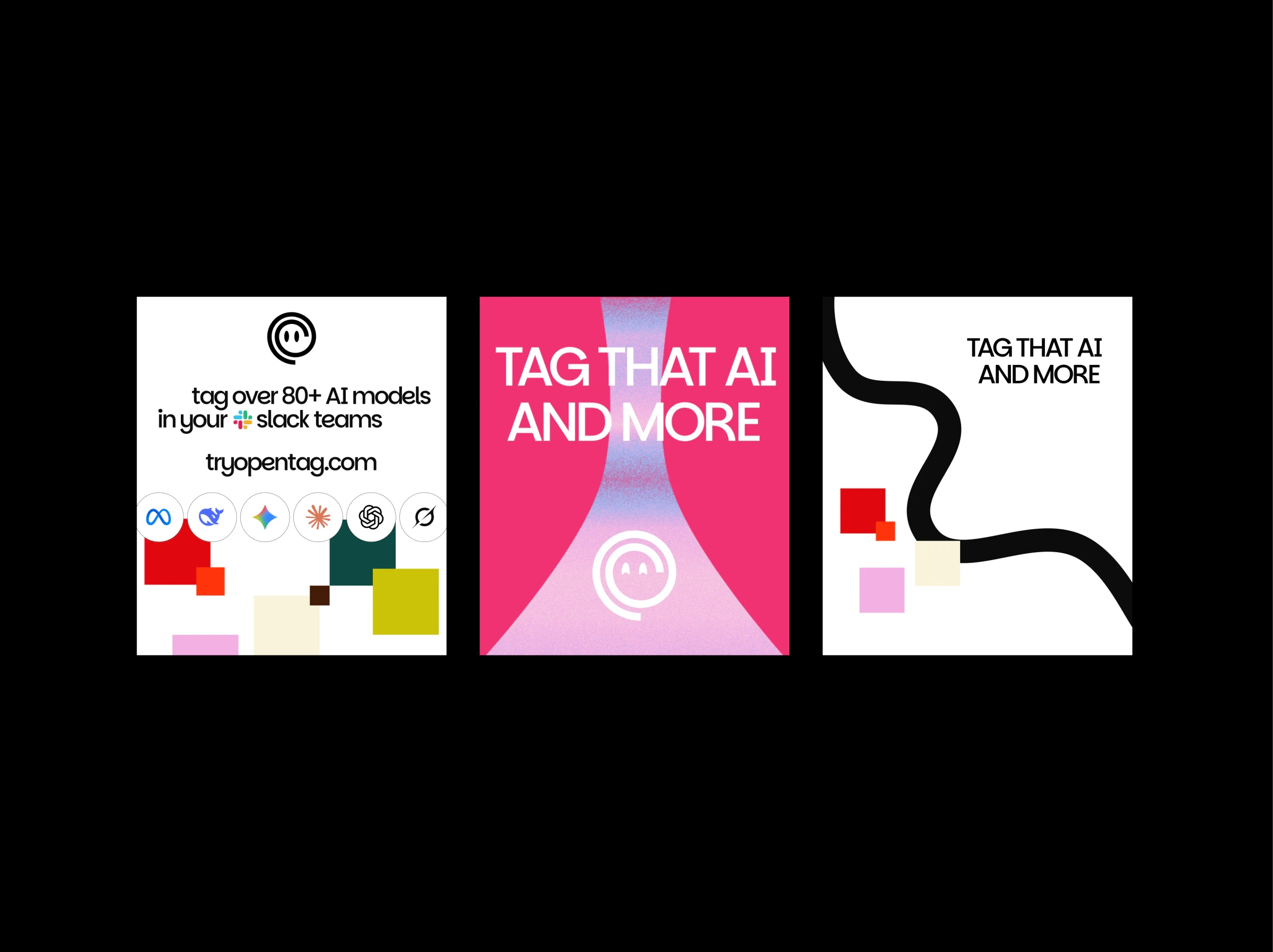
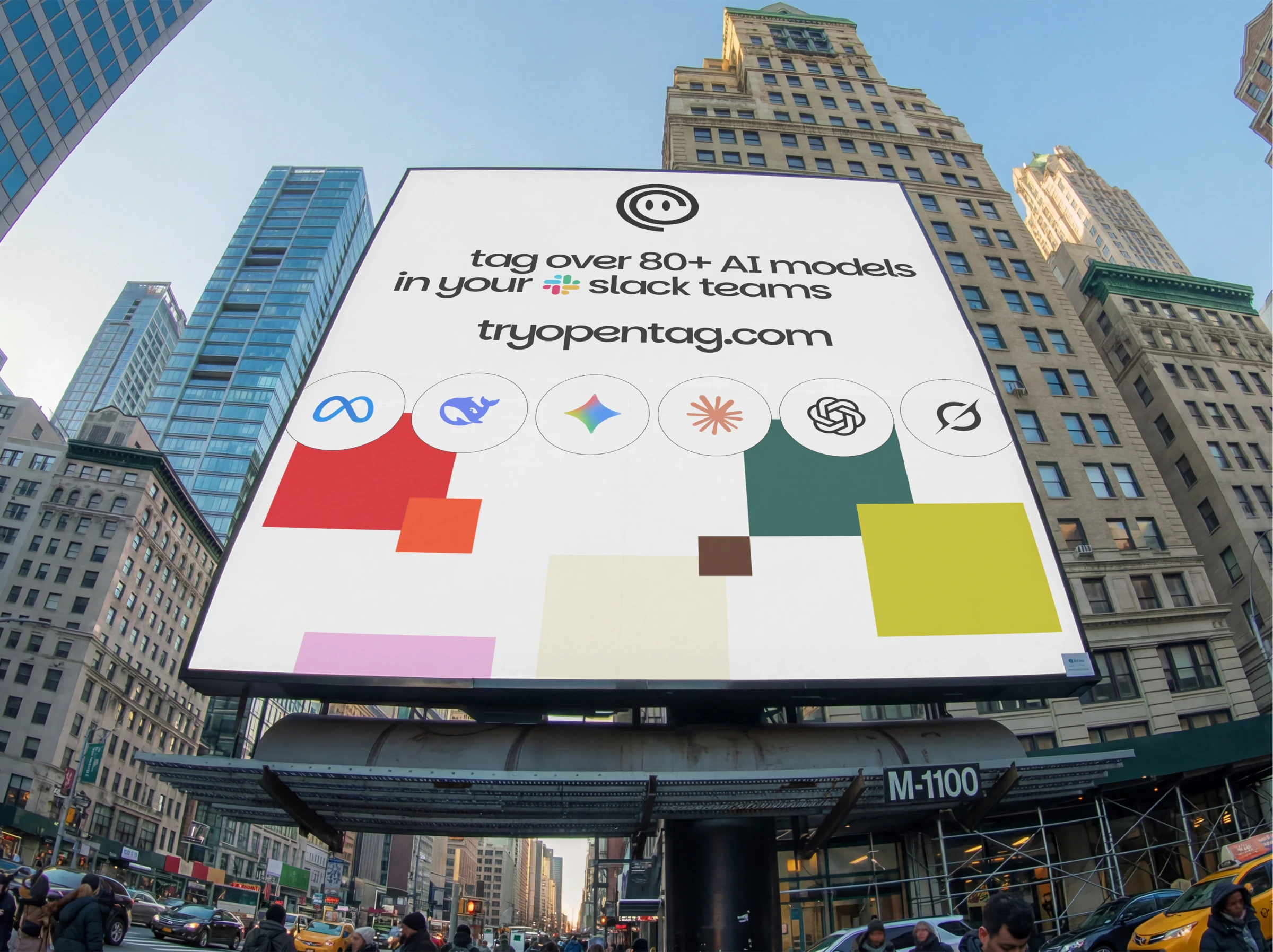
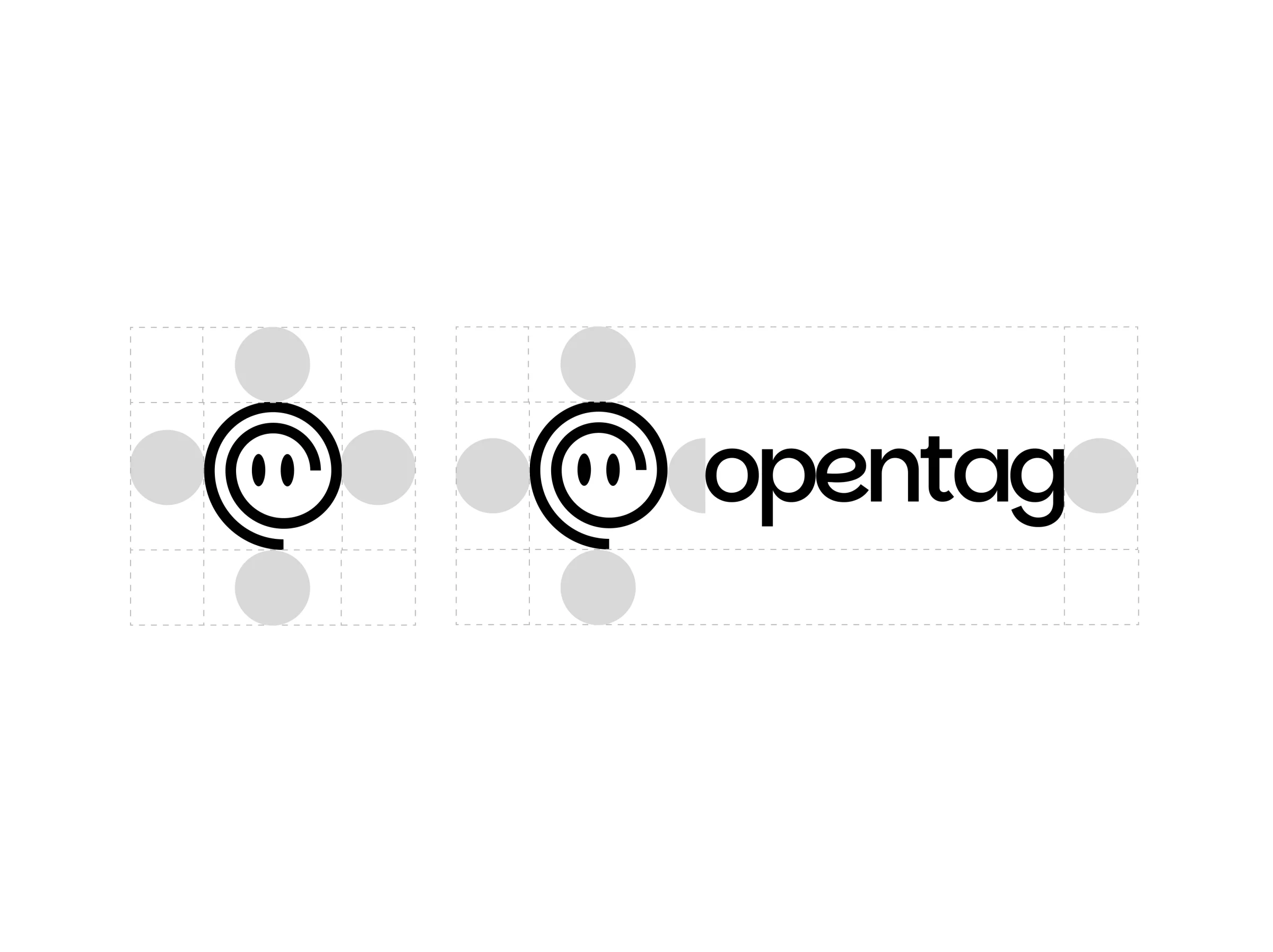
Everything about OpenTag, down to its name, comes back to one action: the @ tag. So the new mark is built from the @ sign itself.
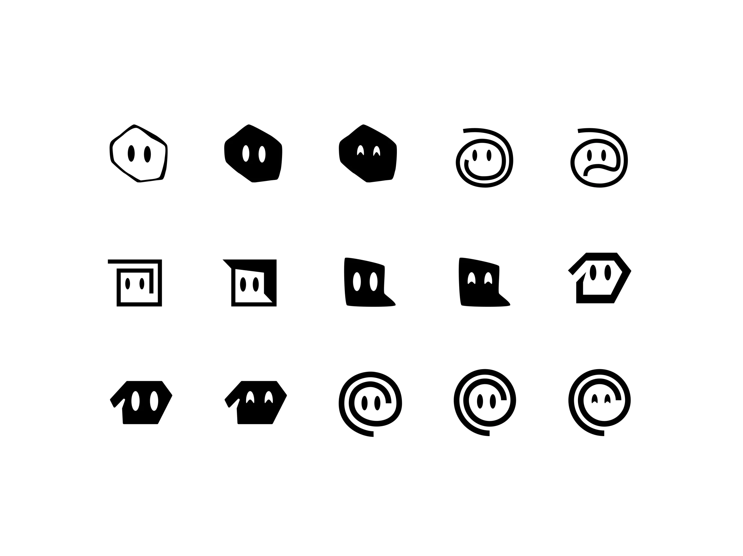
The eyes keep the friendly, avatar-like feel. The negative space reads as a ghost, or a genie: a nod to Gini, the name OpenTag carried into YC.
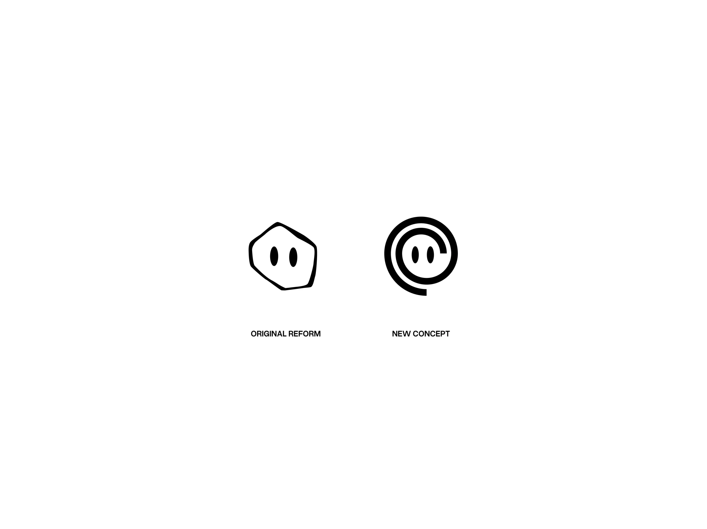
The original mark had three problems: eyes that barely stood out from the brand colour, a face that vanished at favicon size, and a six-sided shape too common to remember.
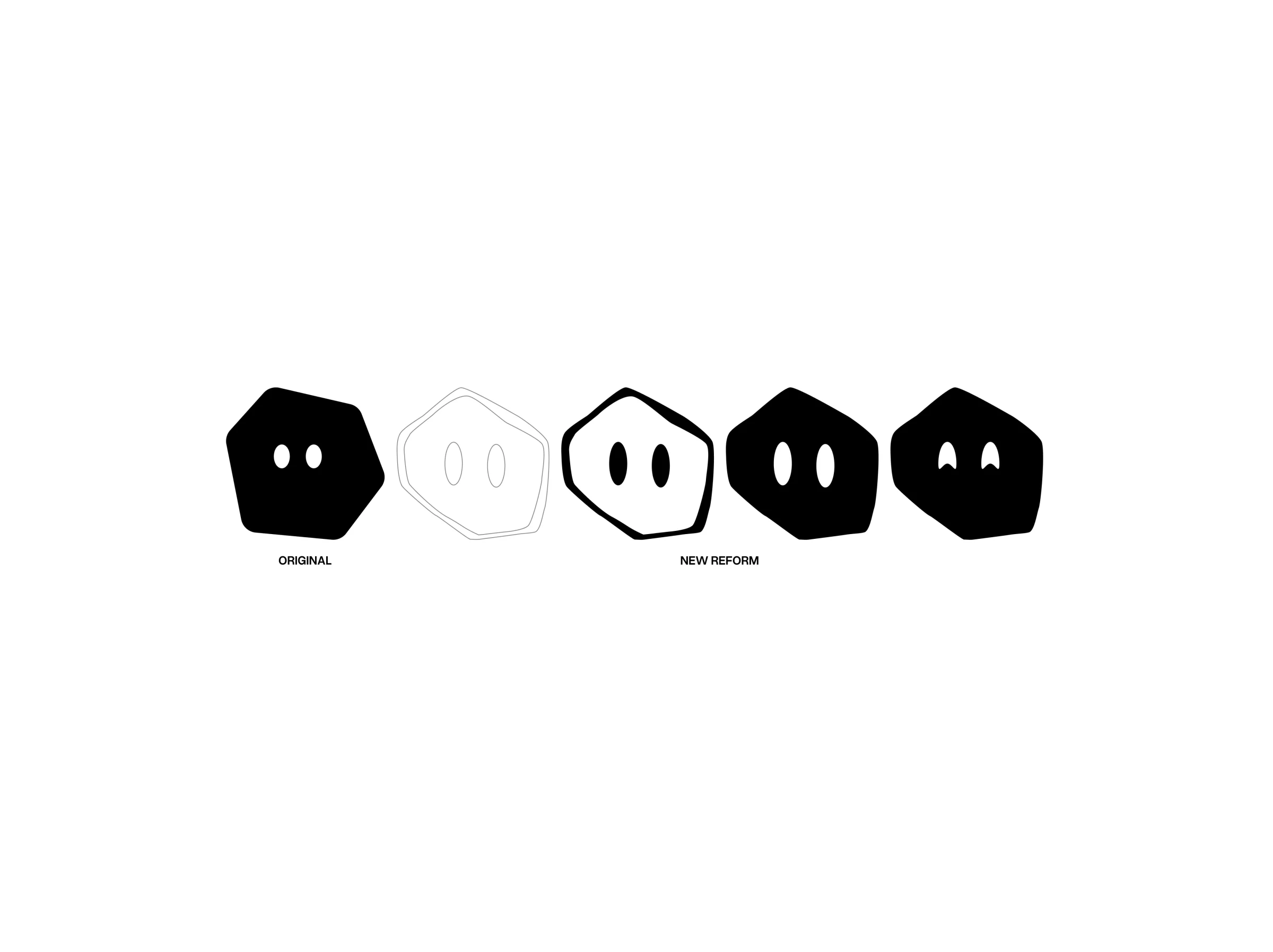


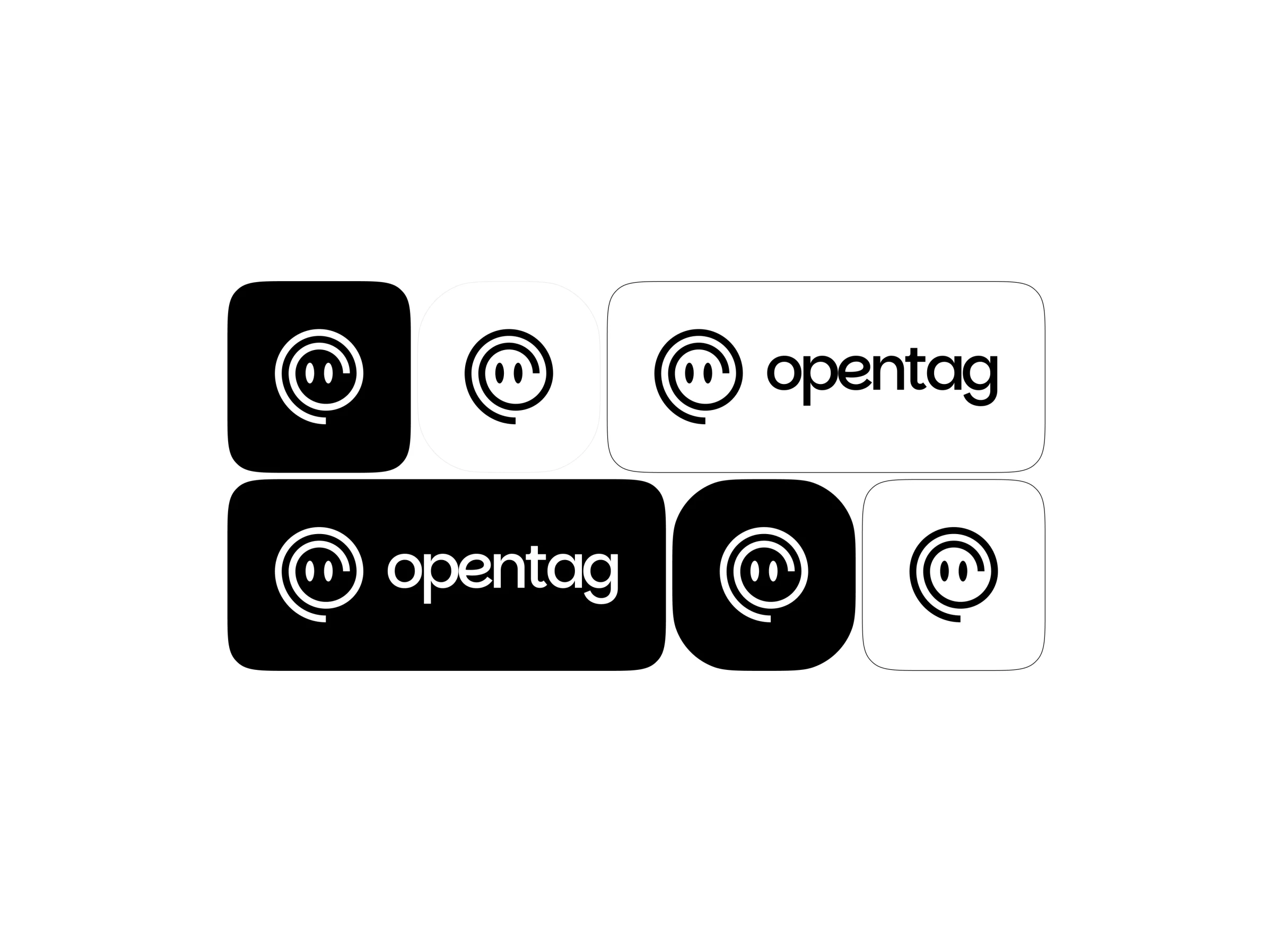
OpenTag Sans is a custom typeface based on Parkin Sans: a clean geometric skeleton for confidence, with small humanist details that keep it approachable.
- Client
- OpenTag
- Year
- 2026
- Services
- brand identity, logo design, custom typeface
OpenTag is a YC-backed AI coworker that lives in your team’s Slack. It follows the conversation and draws on over 80 AI models to get work done. This is an unsolicited concept rebrand, built only from public information.
The original mark
The existing logo showed a company at a very early stage, and it broke a few of branding’s basic rules. The eyes barely stood out against the brand colour, so to some people the mark read as a six-sided blob. Zoomed out, as a favicon in a browser tab, the eyes were too small to read as eyes at all. And the hexagon is a common shape, hard to remember or tie to OpenTag.
The first step kept the concept and fixed those three things: contrast, scale and association. A hand-drawn shape made the mark unique, and bigger eyes let it pass the zoom-out test.
A new concept
Brand identity rests on story as much as logic; logic alone rarely works without a story behind it. The action at the heart of OpenTag, and the name itself, is tagging, and it is the @ tag that calls it up. So the new mark expands the @ sign into a shape.
The eyes stay, for a friendly, avatar-like feel. The negative space reads as a ghost or a genie, a nod to Gini, the name OpenTag carried into YC. The result is simple, memorable and tied to what OpenTag does, while building on the original concept.
OpenTag Sans
To make the brand more personal, it has its own typeface. OpenTag Sans is a geometric face based on Parkin Sans: its clean skeleton gives the brand a modern, confident structure, while subtle humanist details in the letterforms keep it approachable and distinctly human.
About the series
This project is part of Making YC Brands Impossible to Forget, a series in which I rebrand a YC startup, value first, to give back to the community. Without access to the founders, I filled the gaps with what I believe would work for OpenTag. Given the chance, I’d love to talk with them, explore more concepts and take it through the full process.
If you’re on the OpenTag team, I’d love to hear what you think. If you know the founders, please tag them so this reaches them.