Digibastion
Brand identity for a security platform built to feel friendly. Founded by Raiders, a researcher recognised by the Ethereum Foundation.
A bastion is the part of a fort's wall that protects the whole fort and everyone inside it. Digibastion takes that role online.
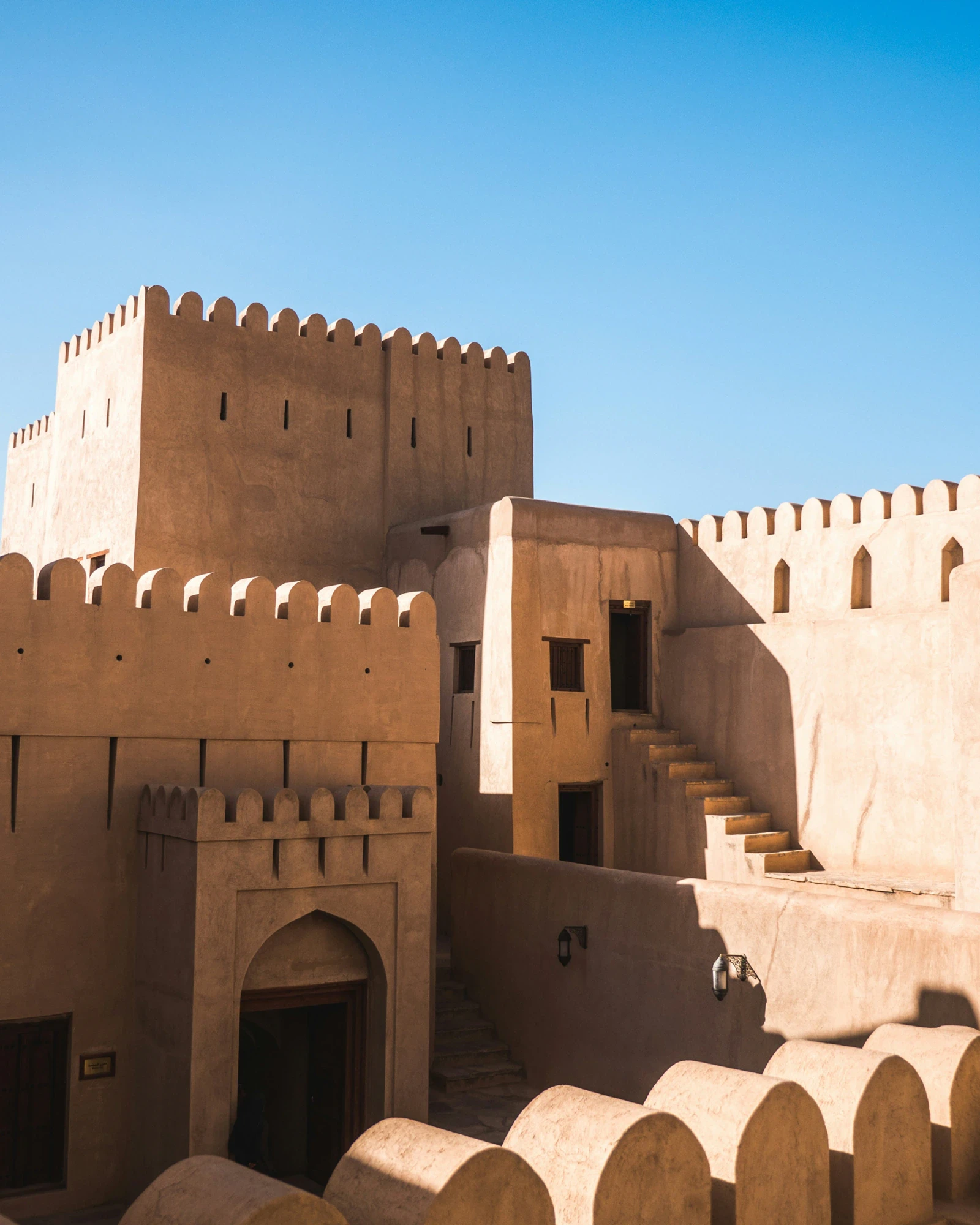

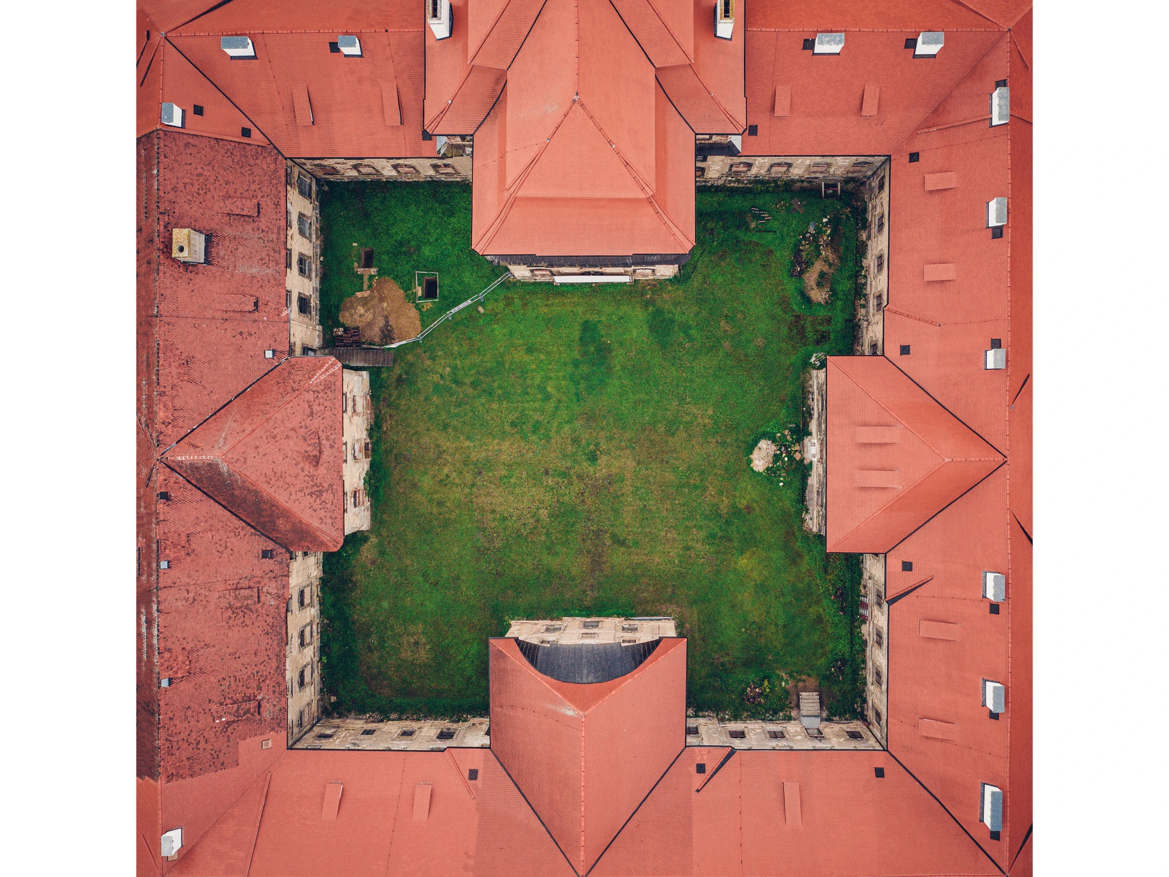
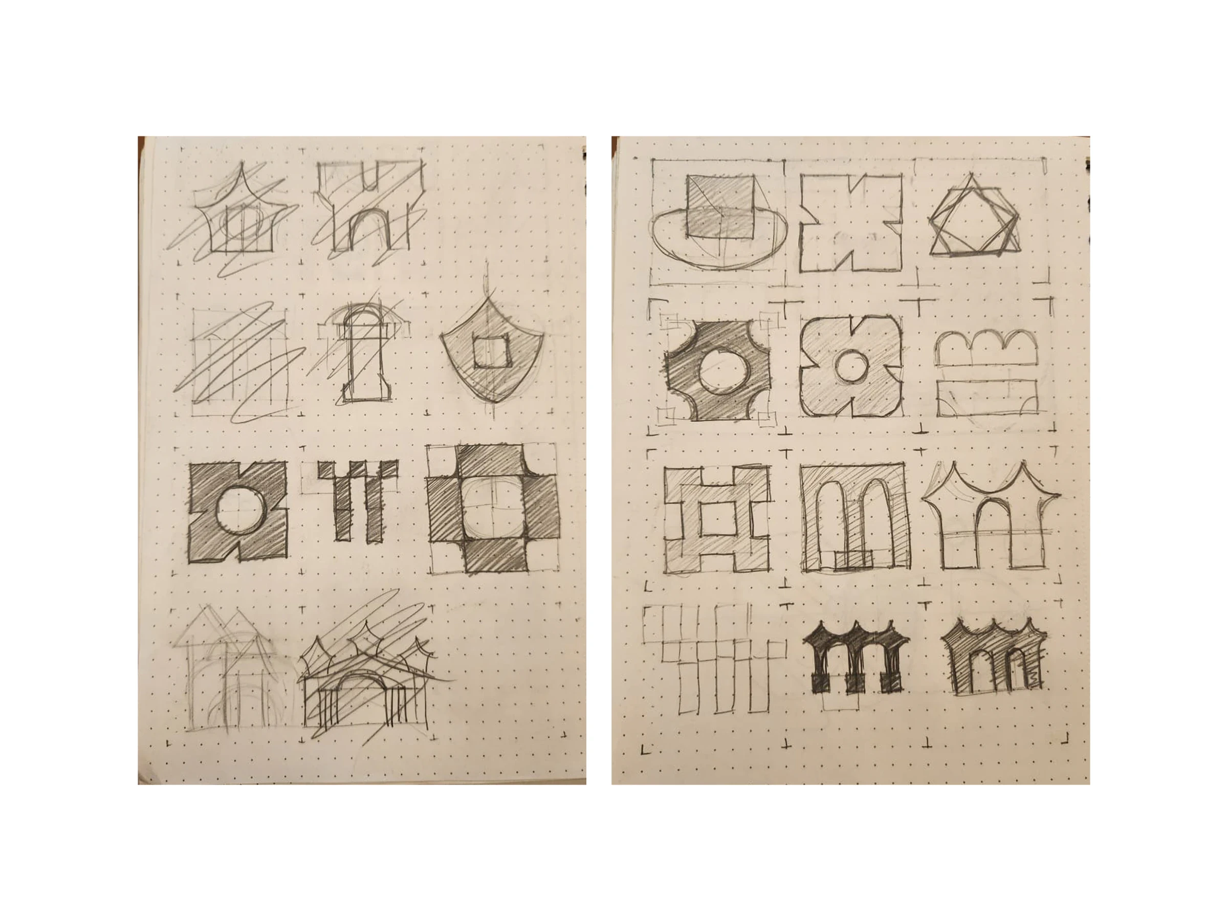
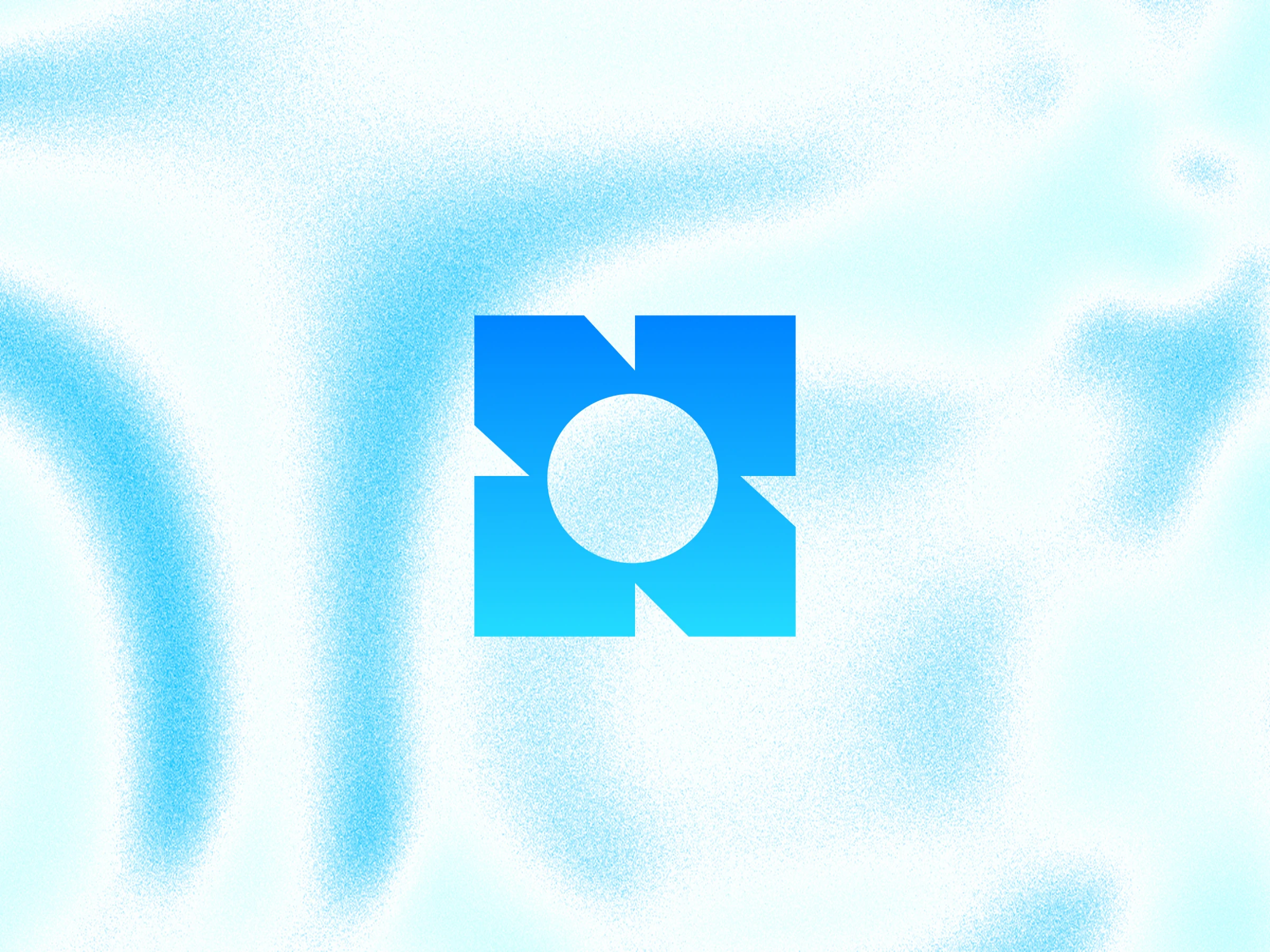
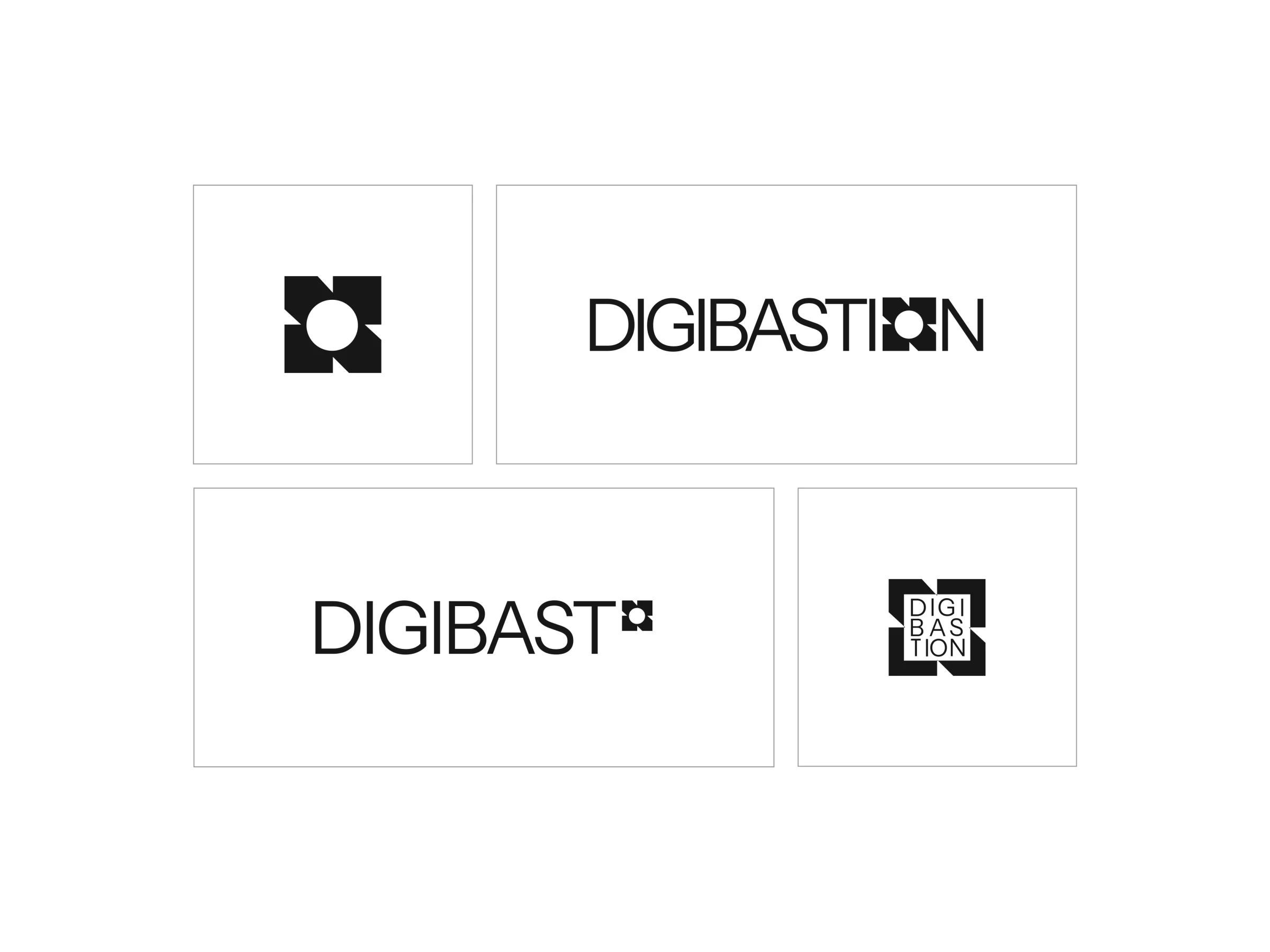
The mark is a fort's boundary with a circle at its centre: the walls stand for protection, the circle for the digital world they guard.
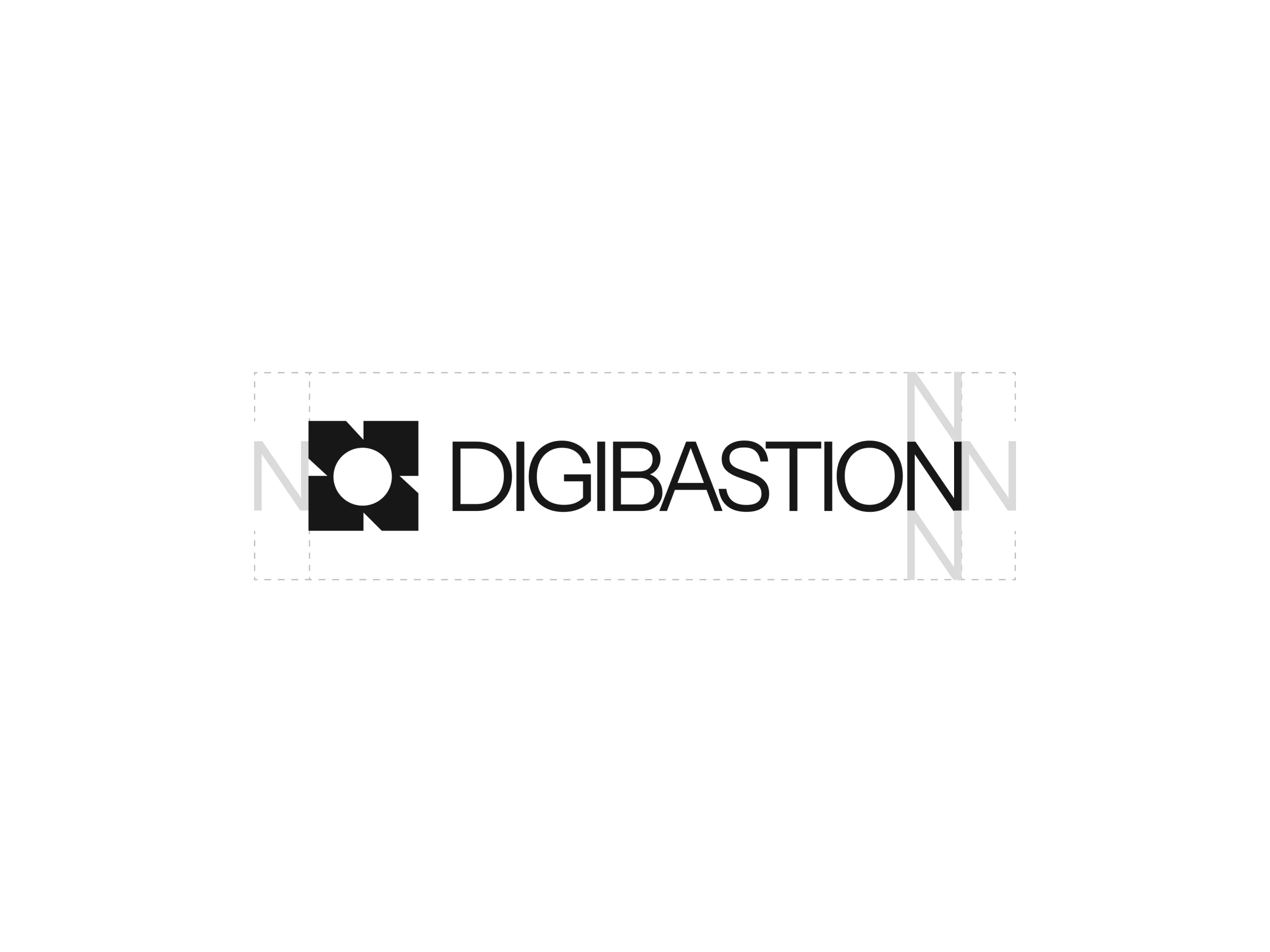
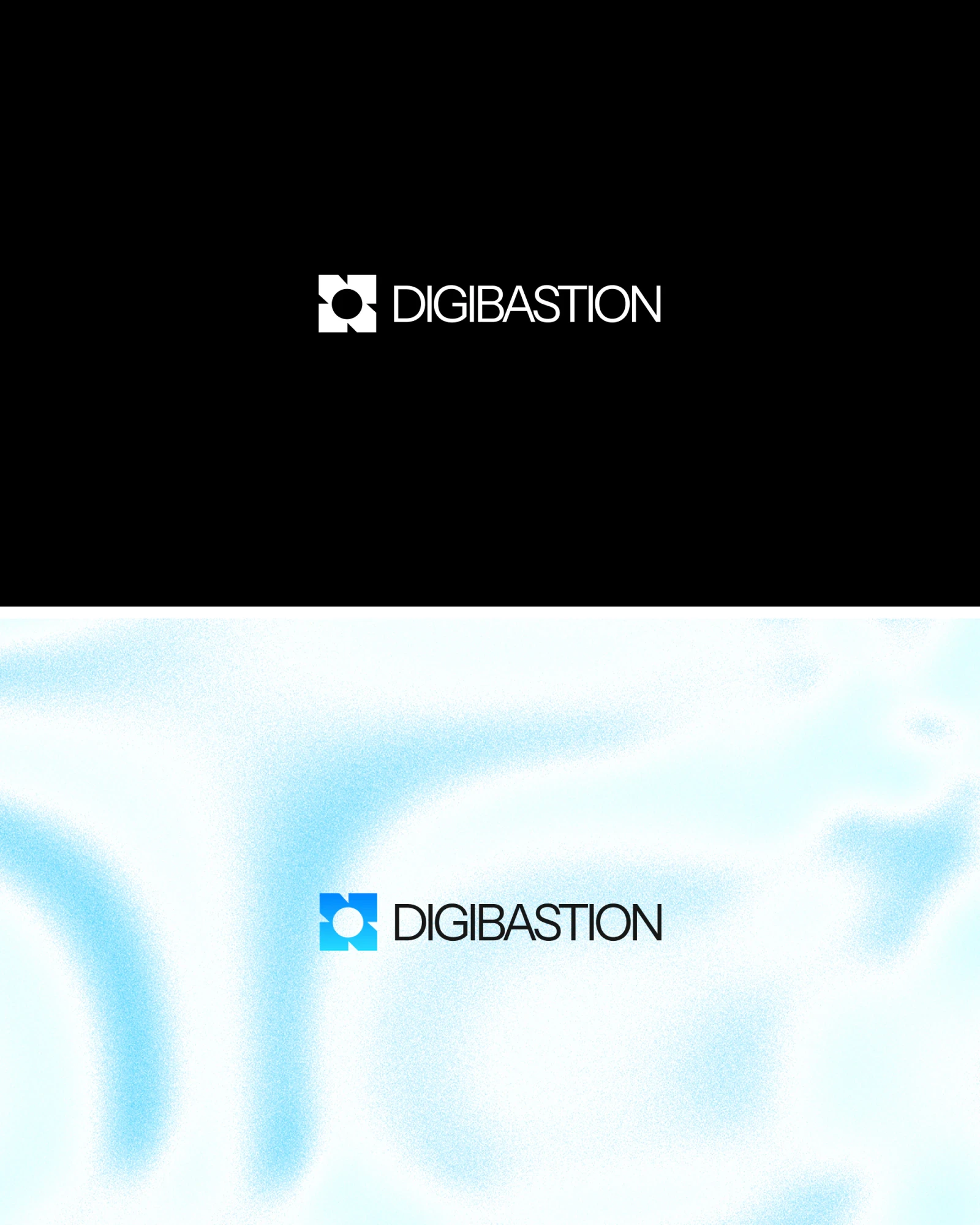
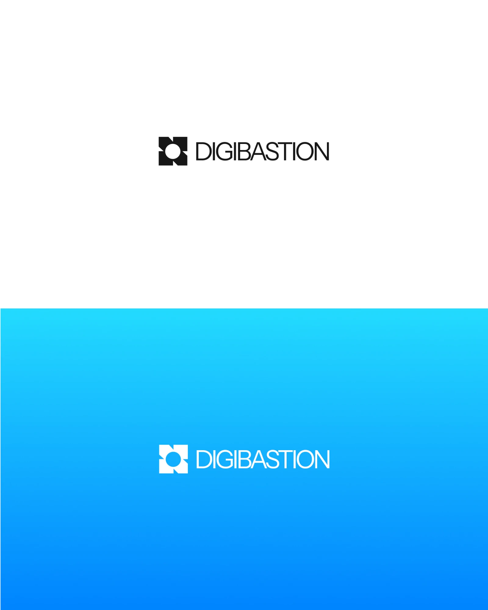
Security brands tend to feel cold and forbidding. Digibastion's colour and type are friendly on purpose, so that anyone feels welcome to use it.
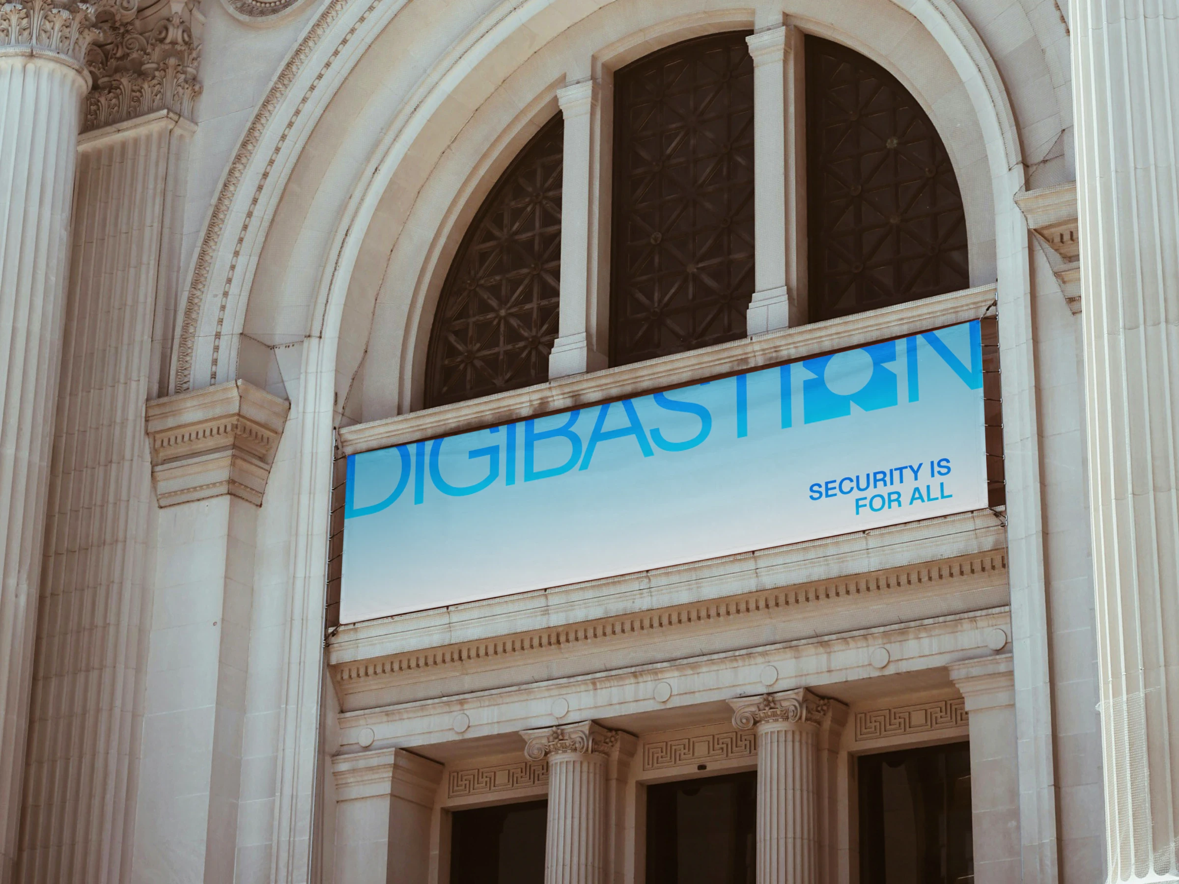
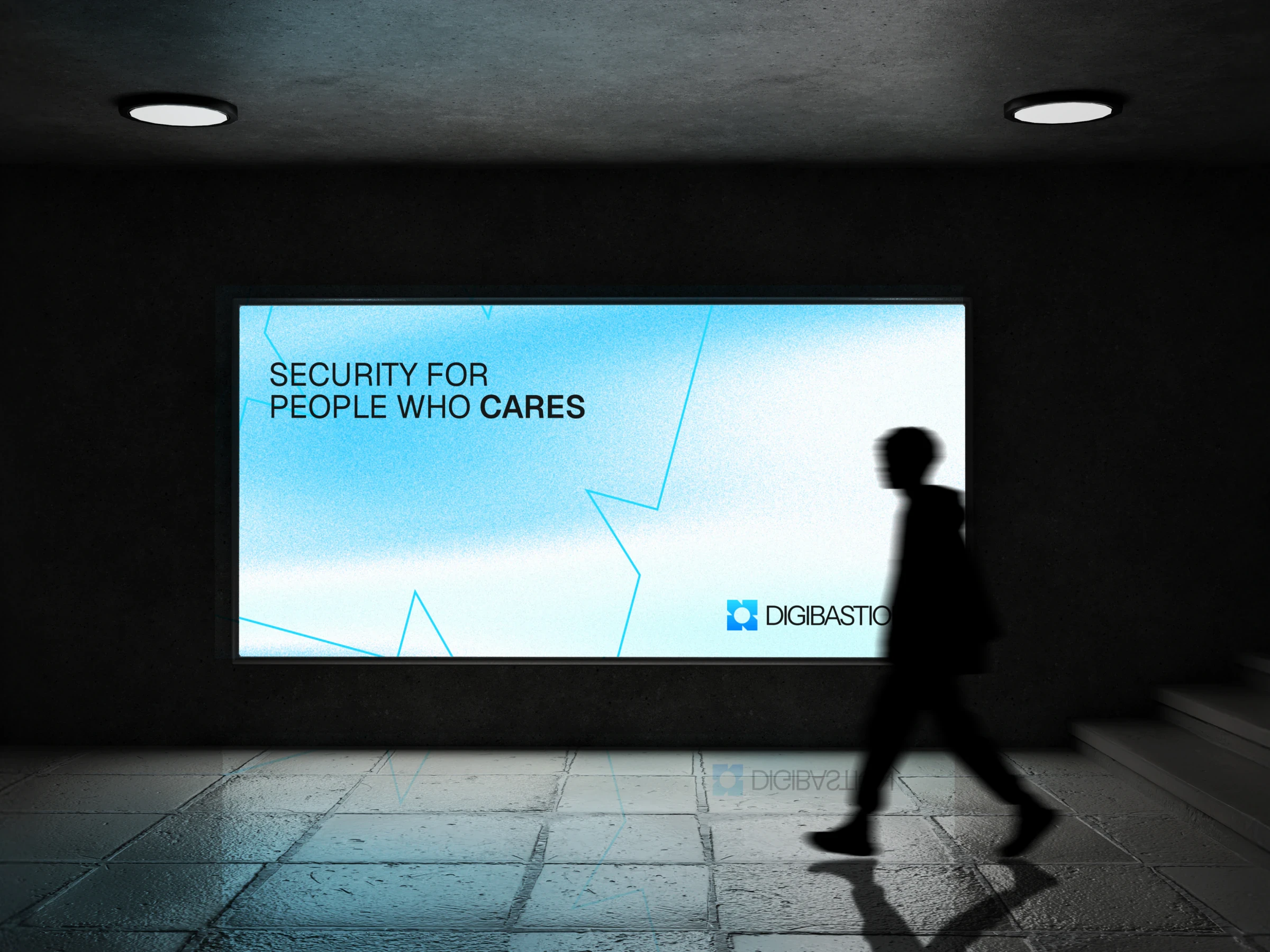
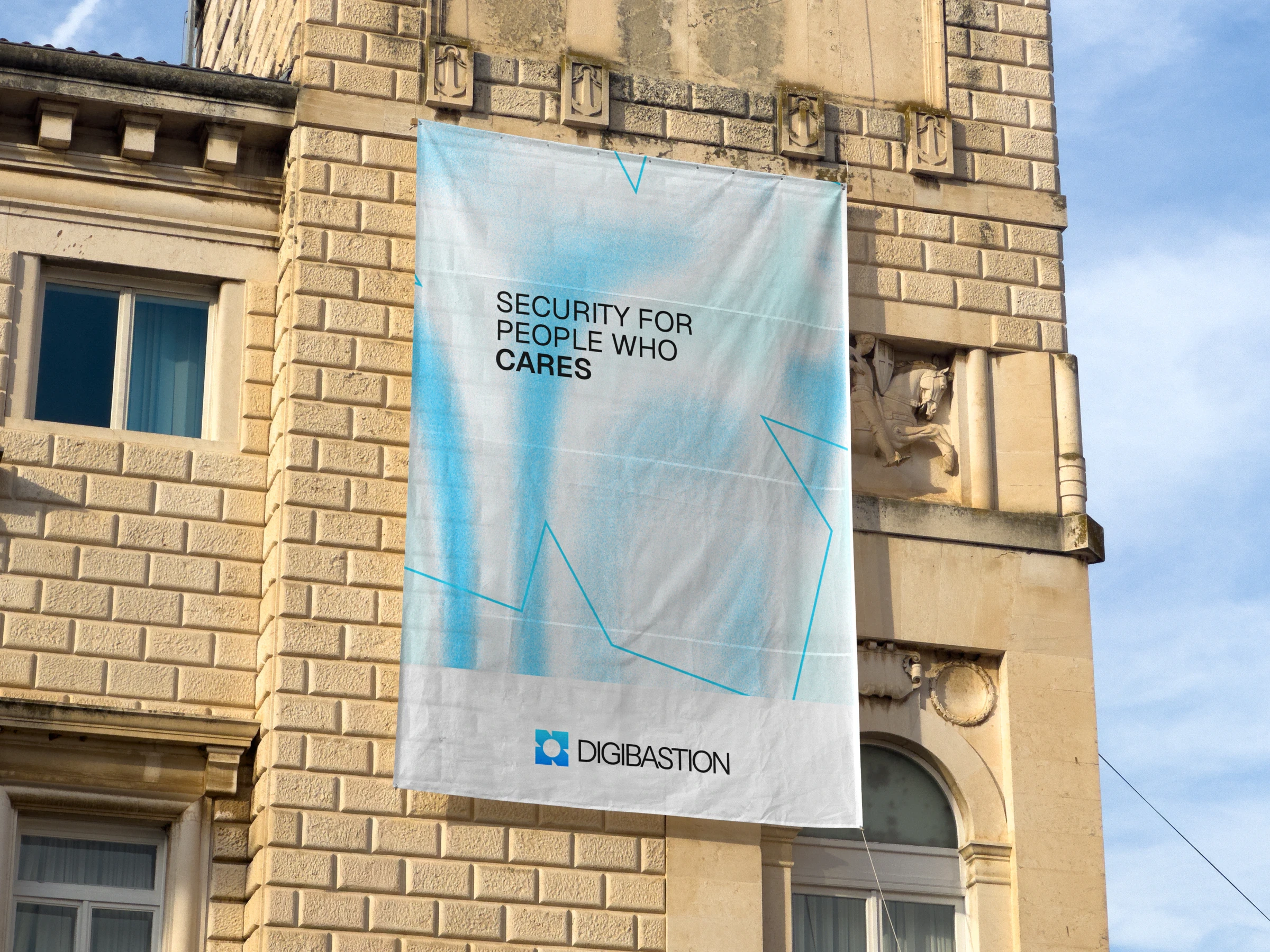
From billboards to the product itself, the identity carries one idea: security is for all.
- Client
- Digibastion
- Year
- 2026
- Services
- brand identity, logo design, visual system
Digibastion is a security platform founded by Raiders, a security researcher recognised by the Ethereum Foundation. It is built for two kinds of people: those who want to contribute to the security of digital assets, and those who simply want to use its security tools.
The name
Digibastion joins two words: digital and bastion. A bastion is the angled part of a fort’s wall, the point from which its defenders watch over and protect the whole fort and everyone inside it. The brief was to carry that idea into a brand for the digital world, while staying easy and welcoming to use.
The mark
Early sketches explored the fort itself: its boundary walls, bastions and towers. The final mark is a fort’s boundary with a circle at its centre. The walls stand for protection; the circle is the digital element they guard. It is simple and recognisable, and it tells the story of the name in a single shape.
Colour and type
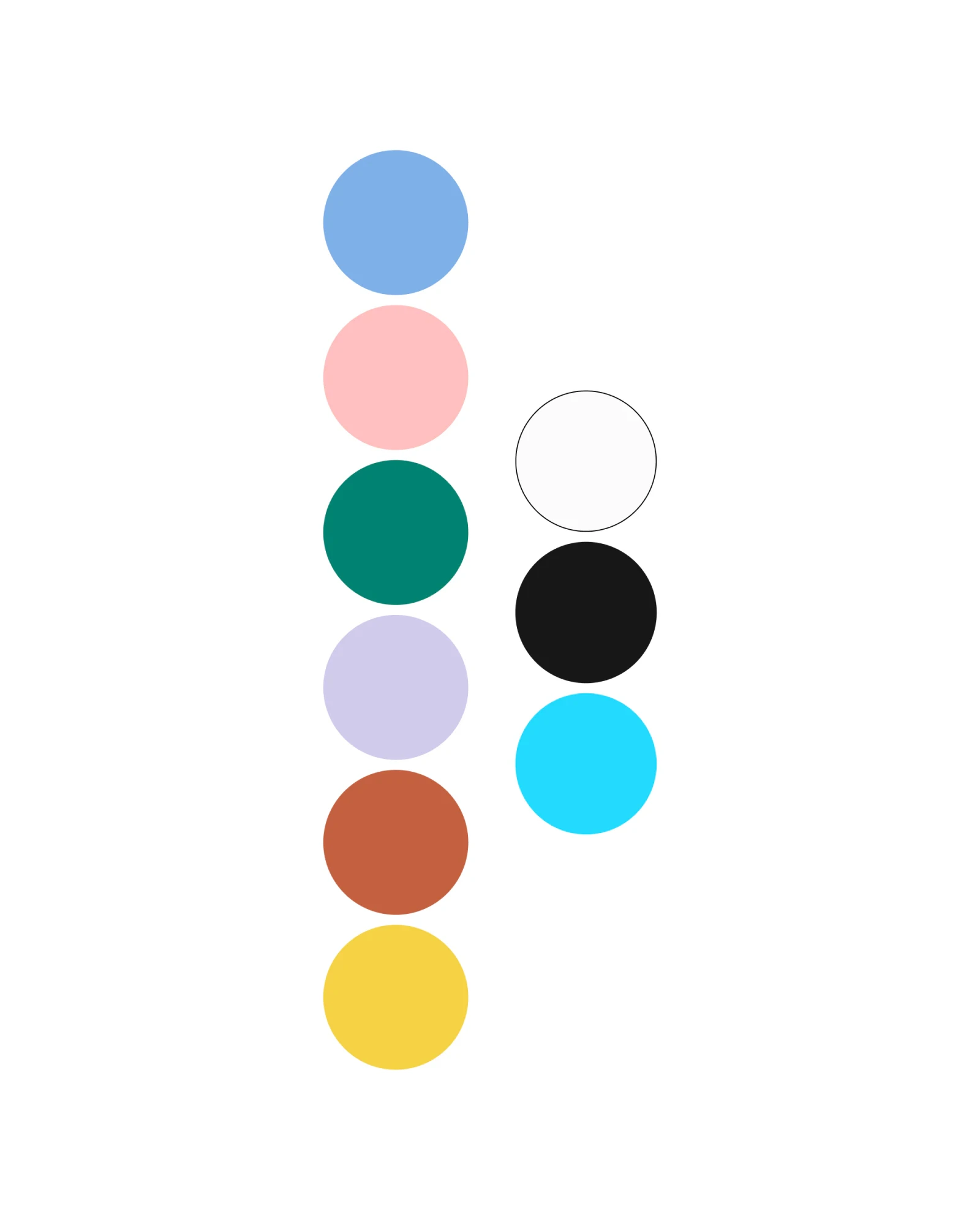
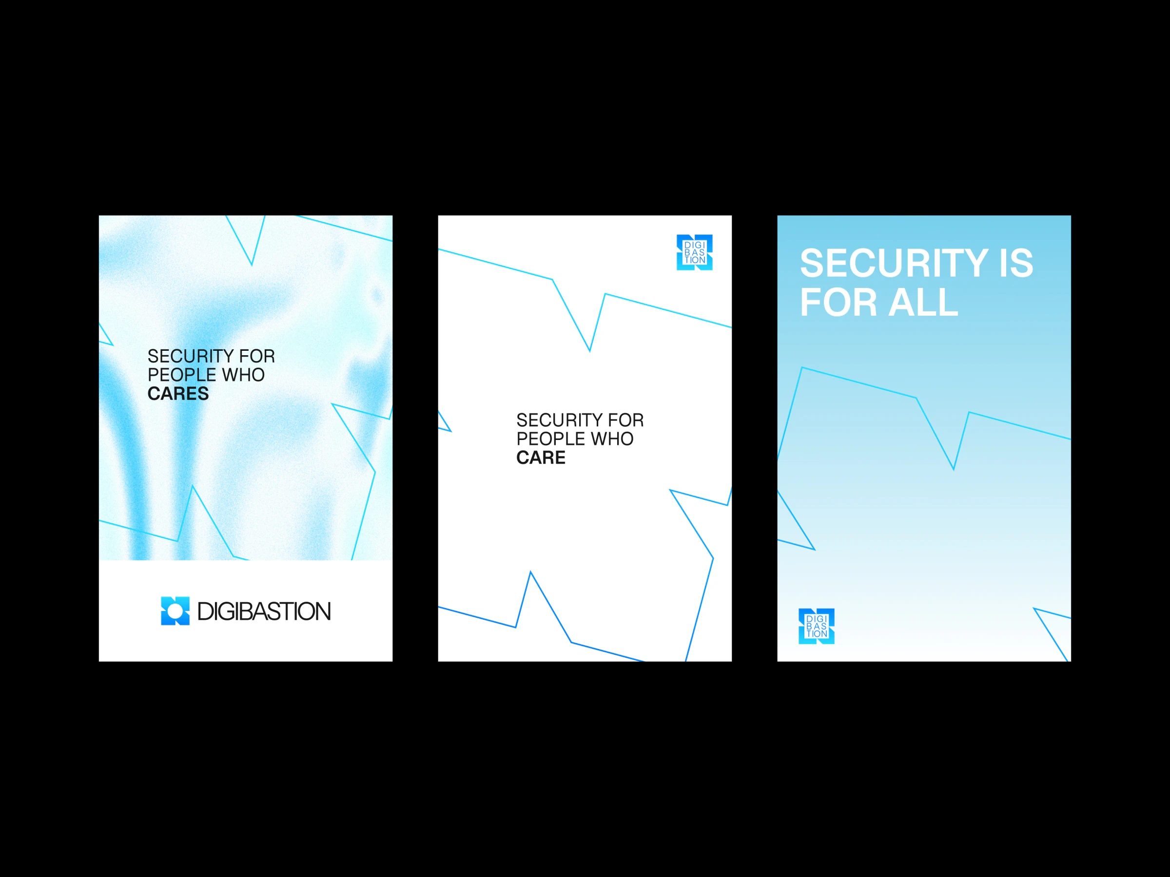
Security brands tend to feel dark, cold and intimidating. Digibastion needed the opposite: a friendly identity, so that anyone could come and use the product without feeling the usual security vibe. A bright sky blue and a soft, liquid gradient lead the palette, supported by pink, green, lavender, rust and yellow. Geist is the primary typeface, with Instrument Sans for the logo.
In use
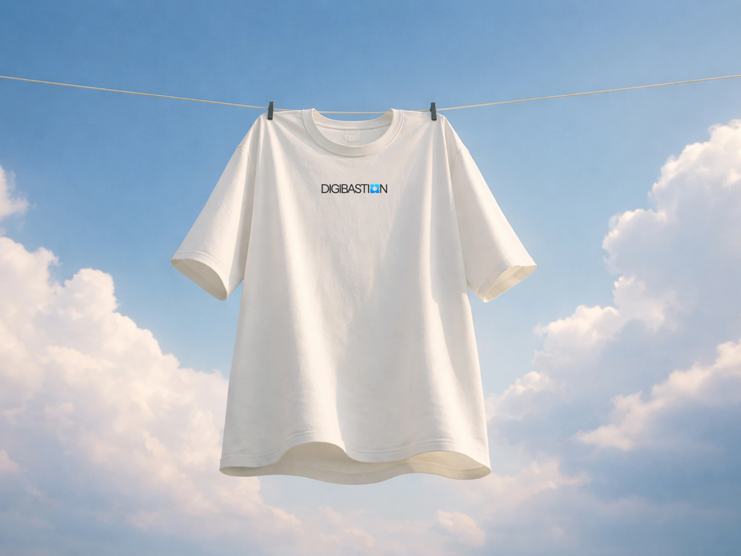
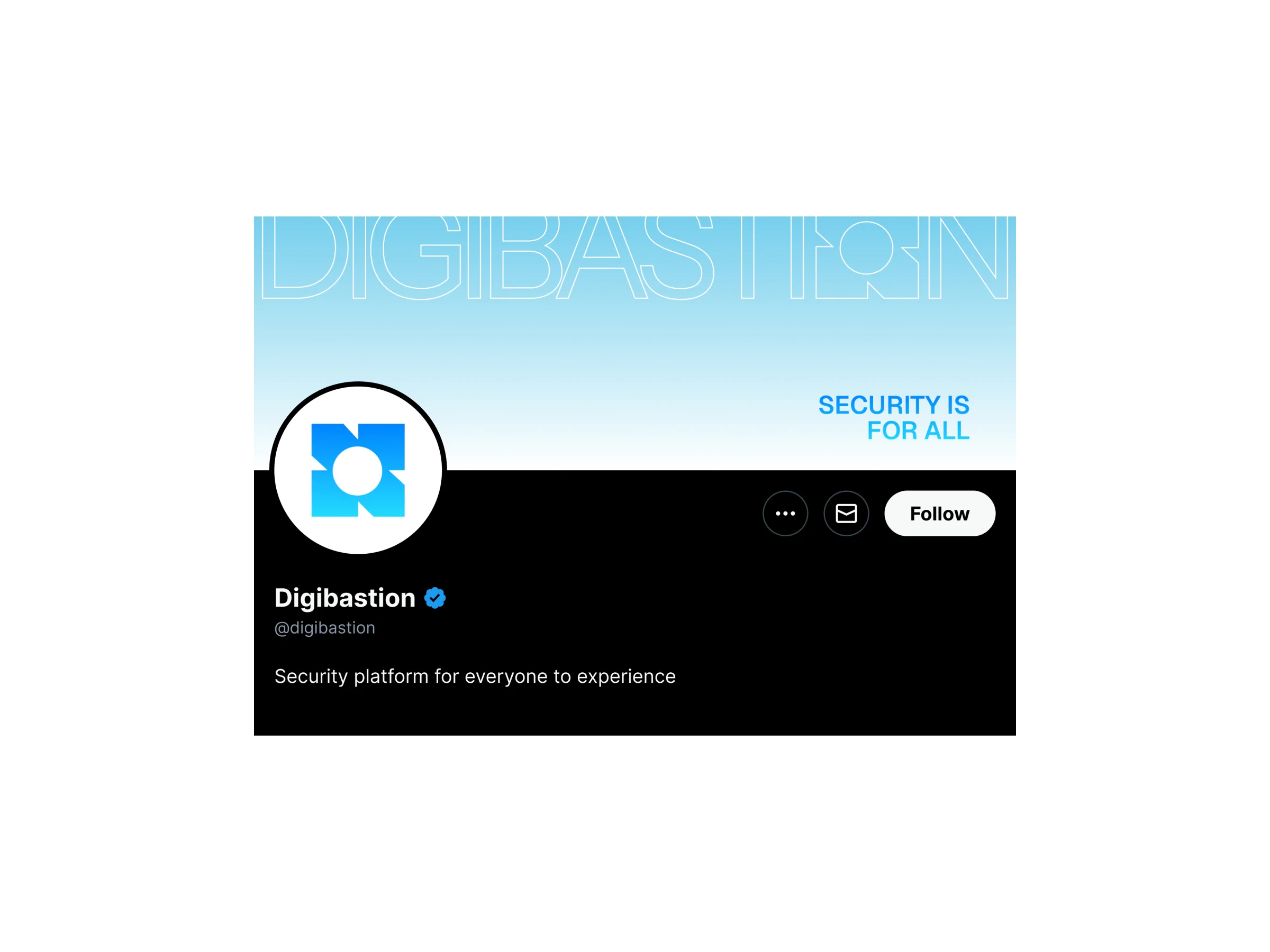
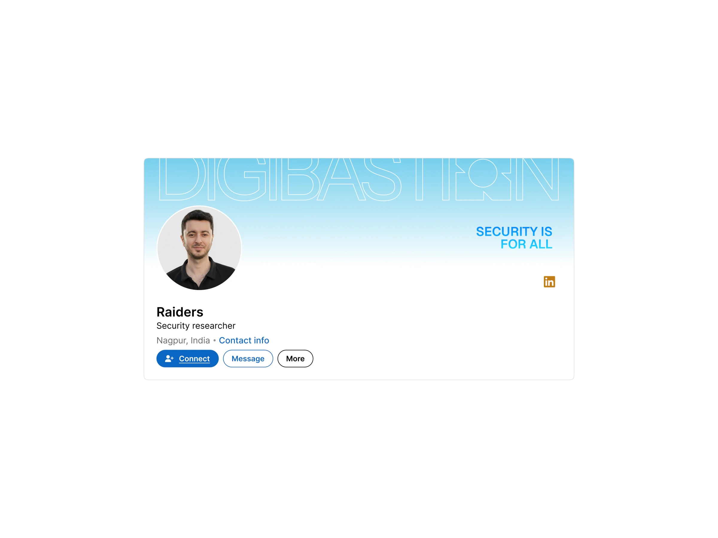
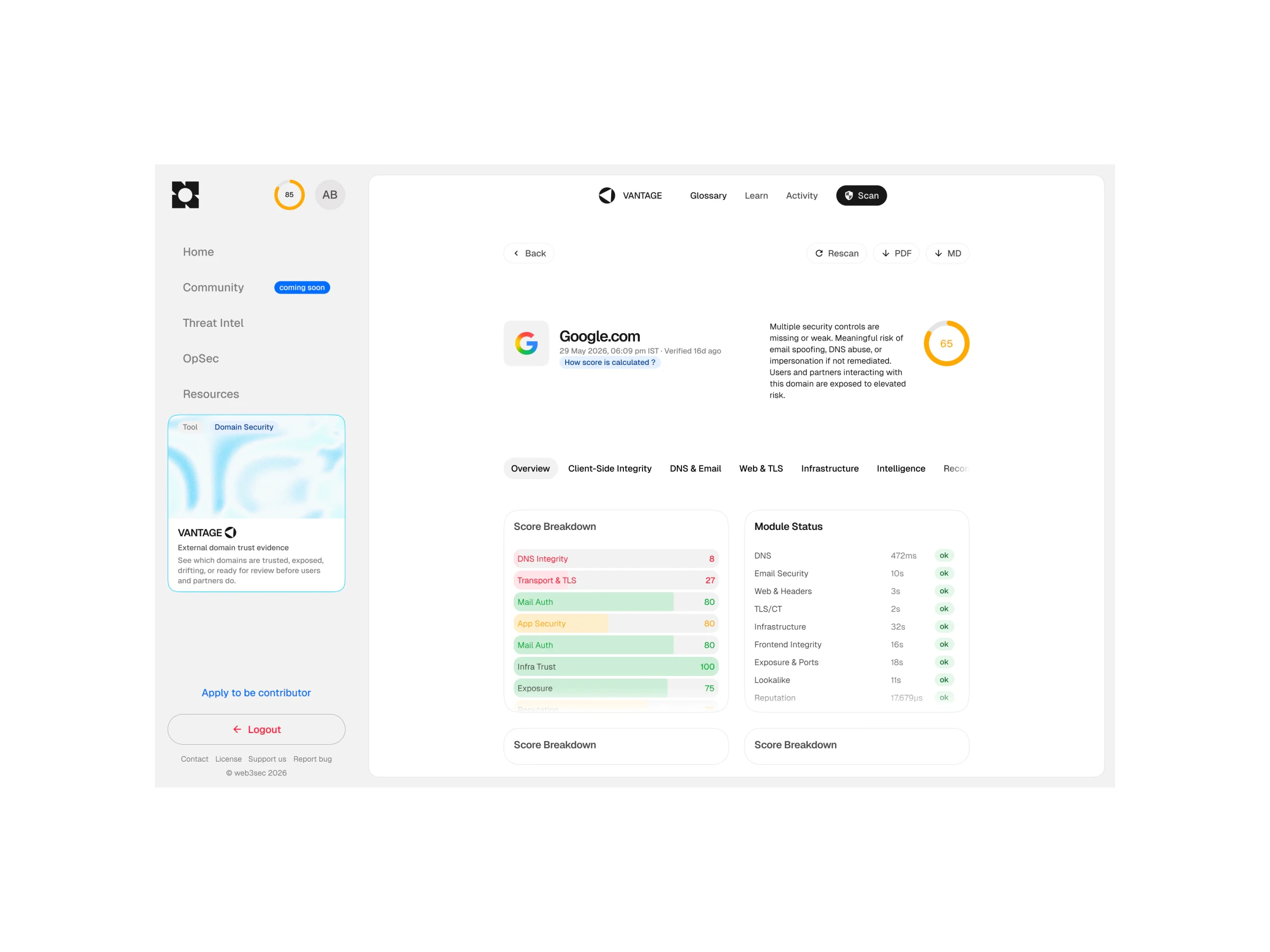
The system runs across billboards, banners, posters, merchandise, social profiles and the product dashboard, carrying the line Security is for all.